
Overview
Berkeley Financial Systems and BearBuy identified the need for a guide system (Digital Adoption Platform) to aid campus staff in using the systems. I led my team through conducting research to test the guides, provide UX recommendations, and work with technical and functional teams to implement suggestions.
Role
Lead UX Researcher & Designer
Led research and design efforts, identified tasks, wrote script, facilitated usability sessions. Completed data analysis and extracted design recommendations. Collaborated with cross-functional teams to implement changes.
Team
Myself, 1 UX Intern, 1 UX Manager
Timeline
6 weeks
Context
Berkeley Financial Systems and BearBuy needed a guide system overlay to support the implementation of complex new financial workflows
A guide system, or Digital Adoption Platform (DAP) overlays other software applications with contextual help. To support the implementation of complex new financial workflows, Berkeley Financial Systems and BearBuy required the implementation of a DAP in their systems.
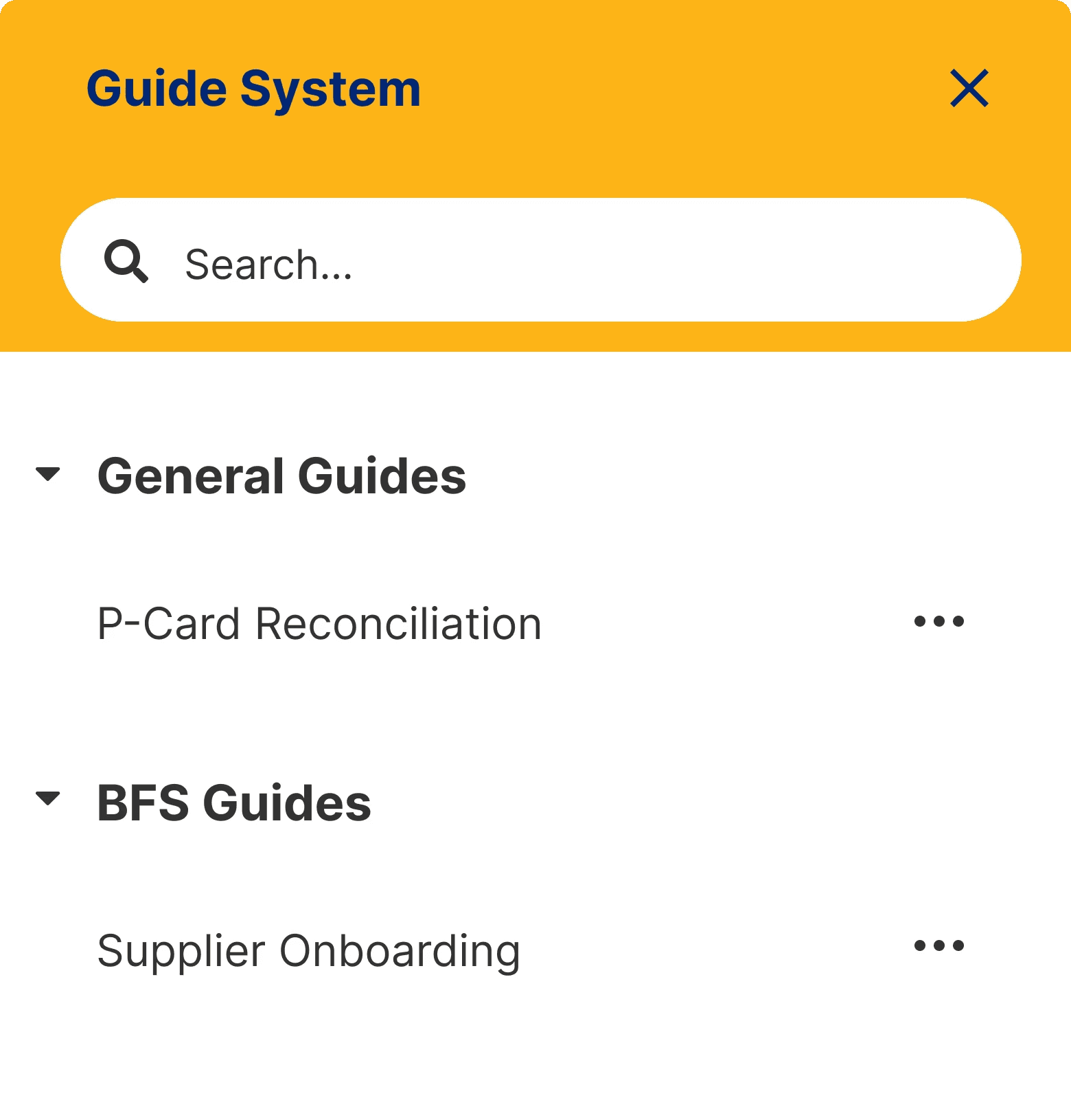
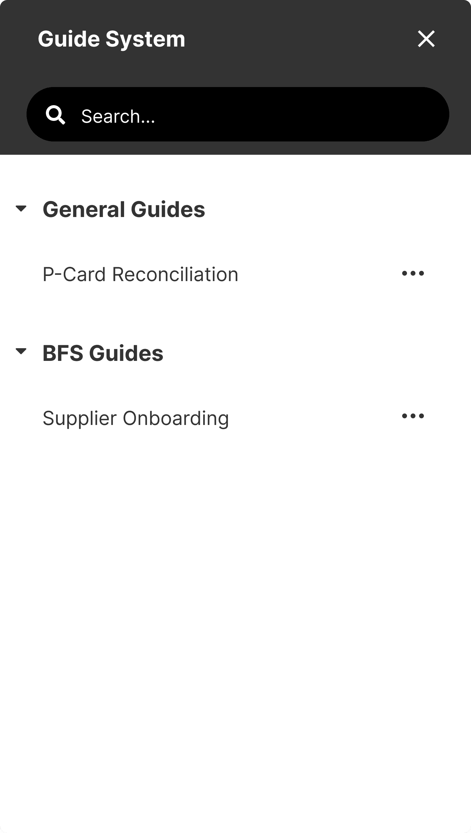
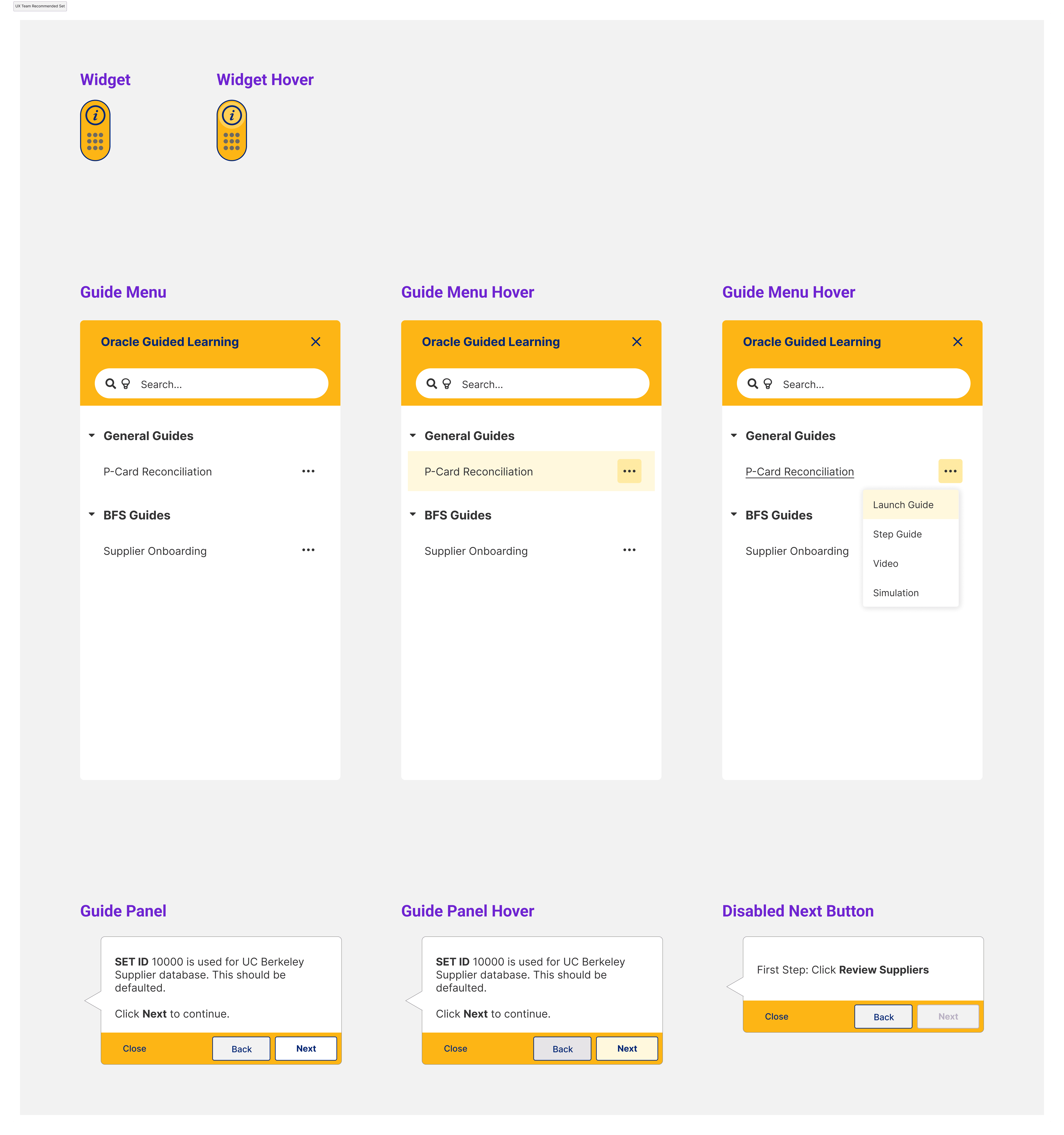
There are a few elements that go into a guide system:
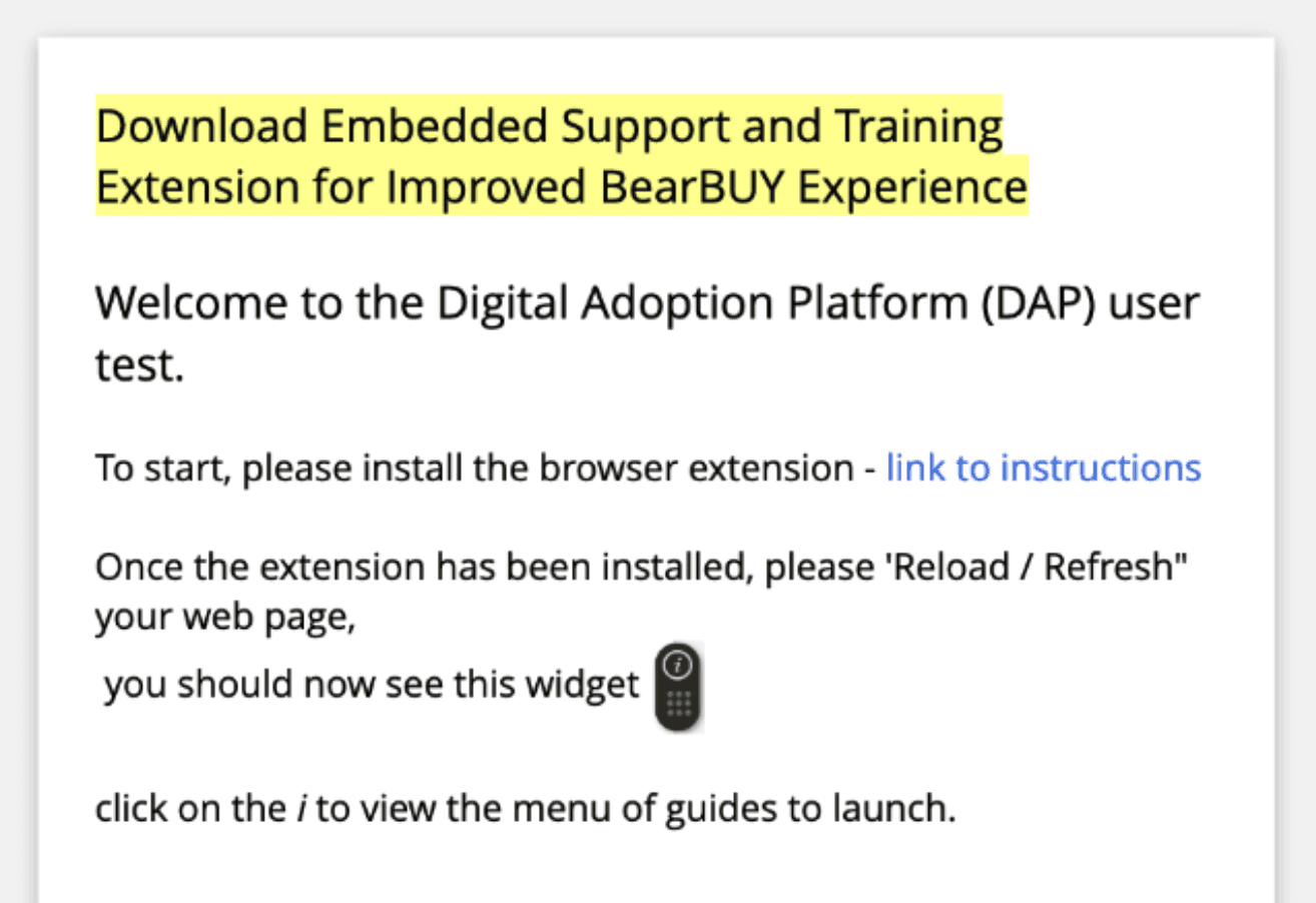
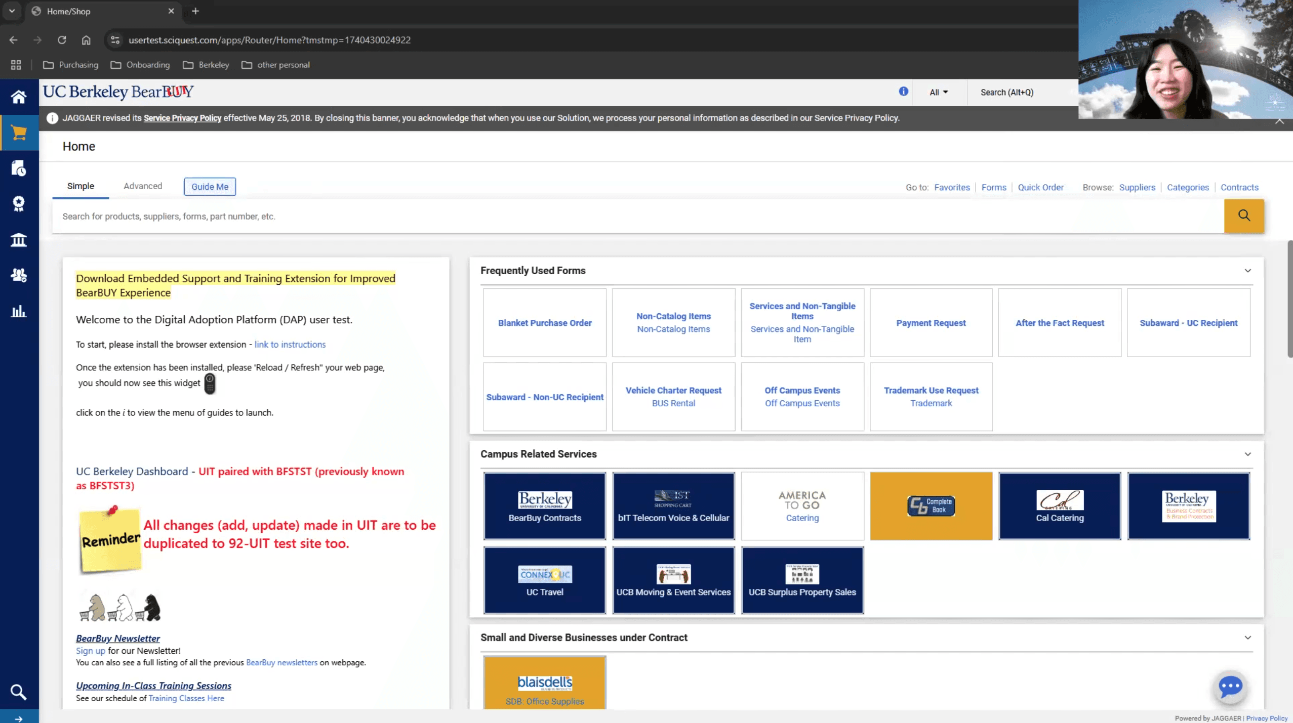
1. Browser Extension to use the guide system

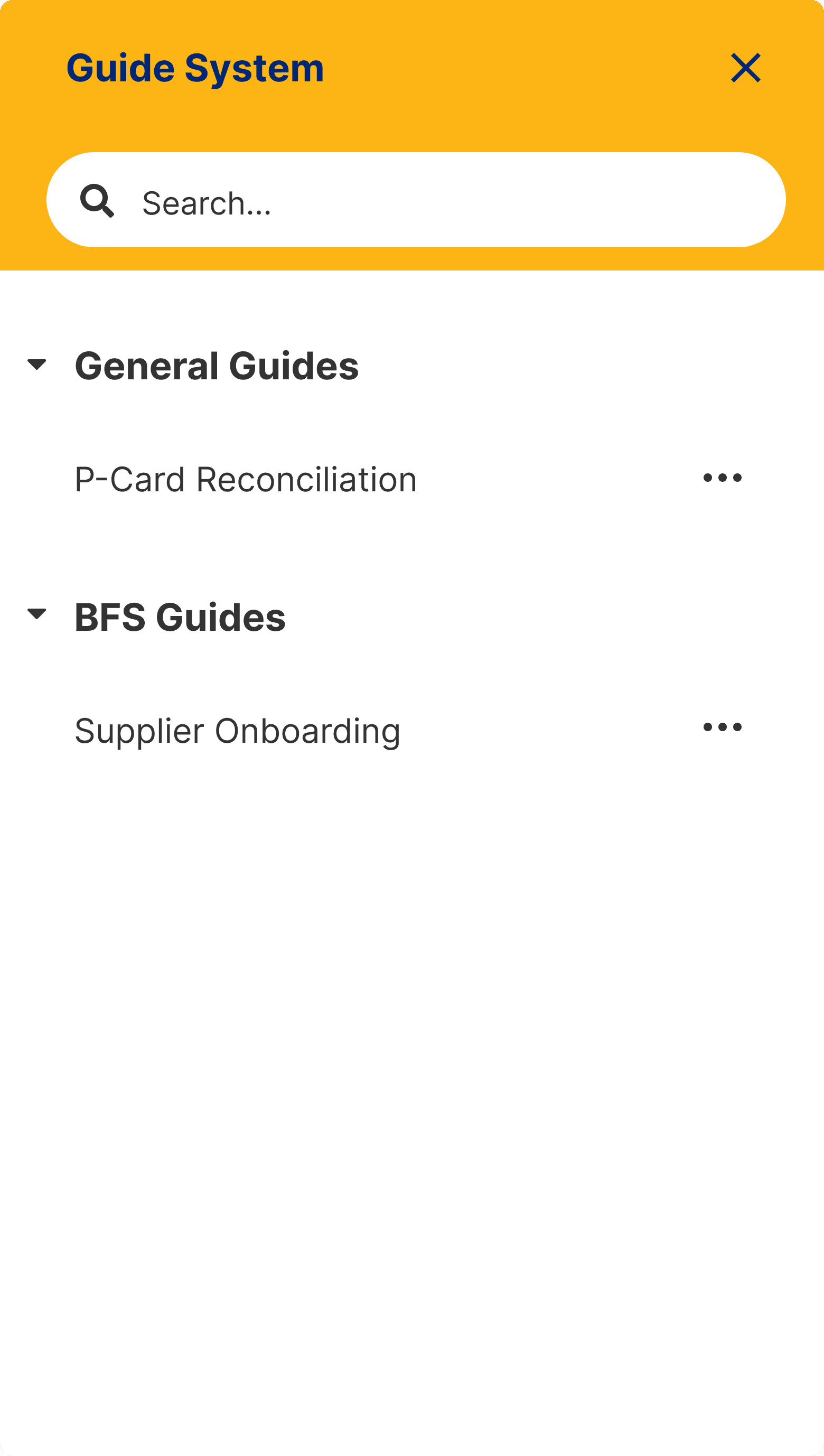
2. Widget to access Process Guides

3. Guide Menu to choose Process Guides
4. Welcome Panel to introduce Process Guides
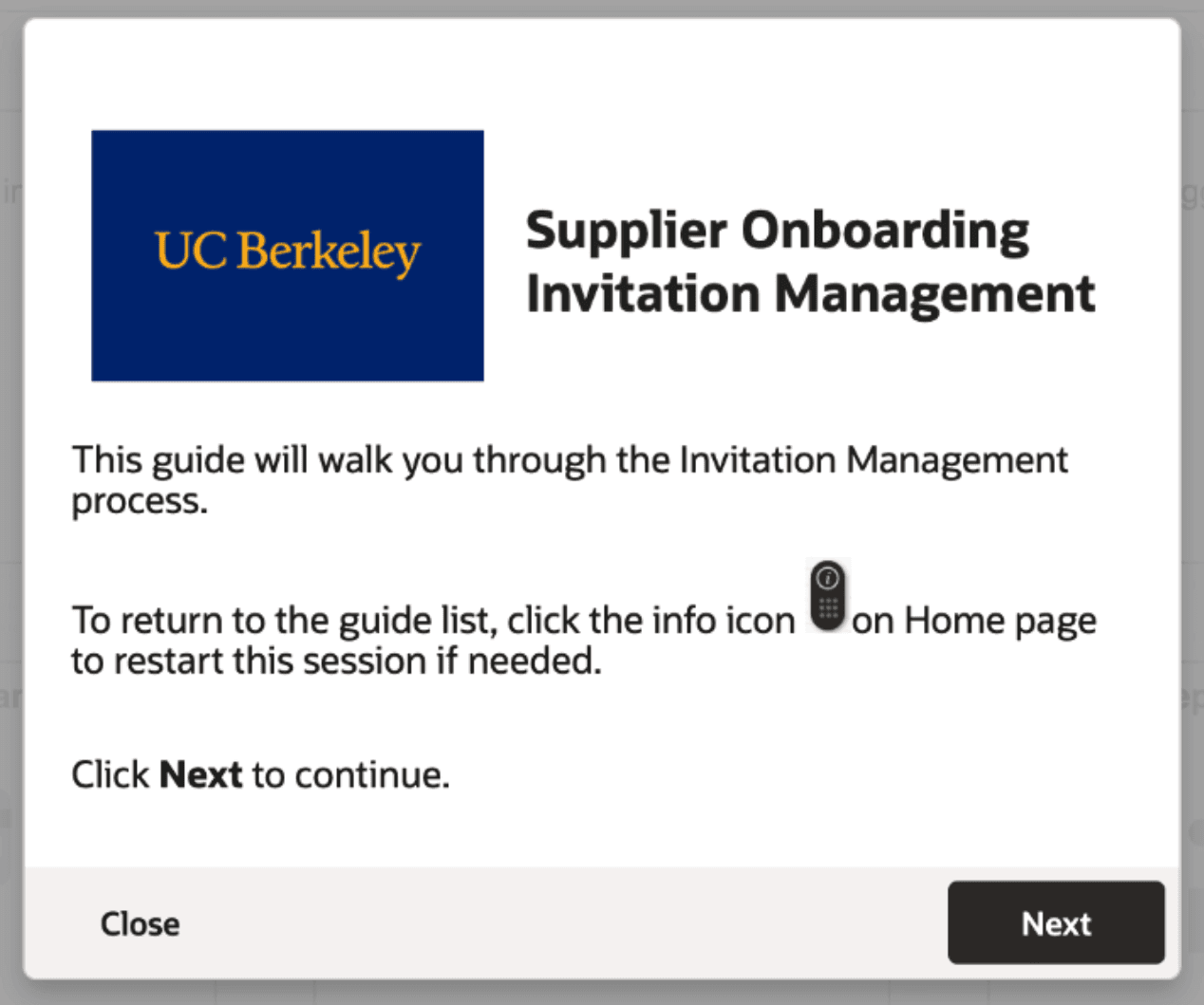
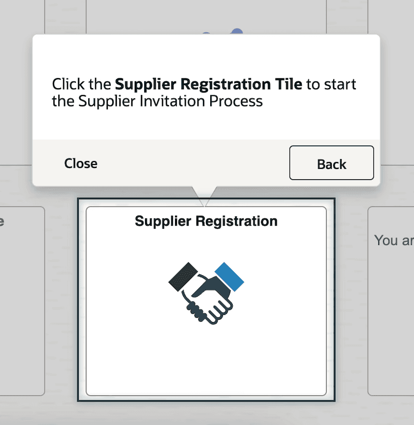
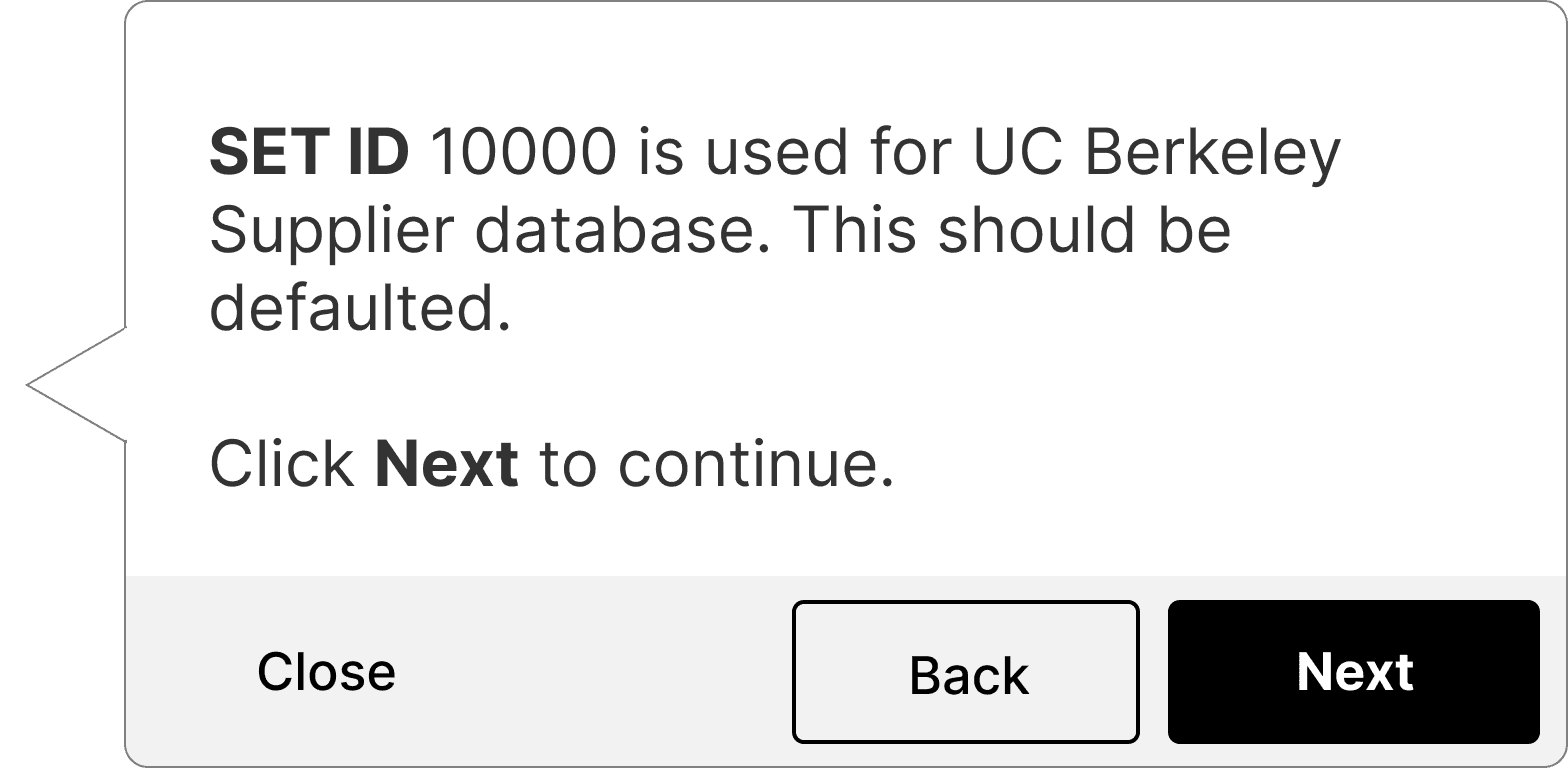
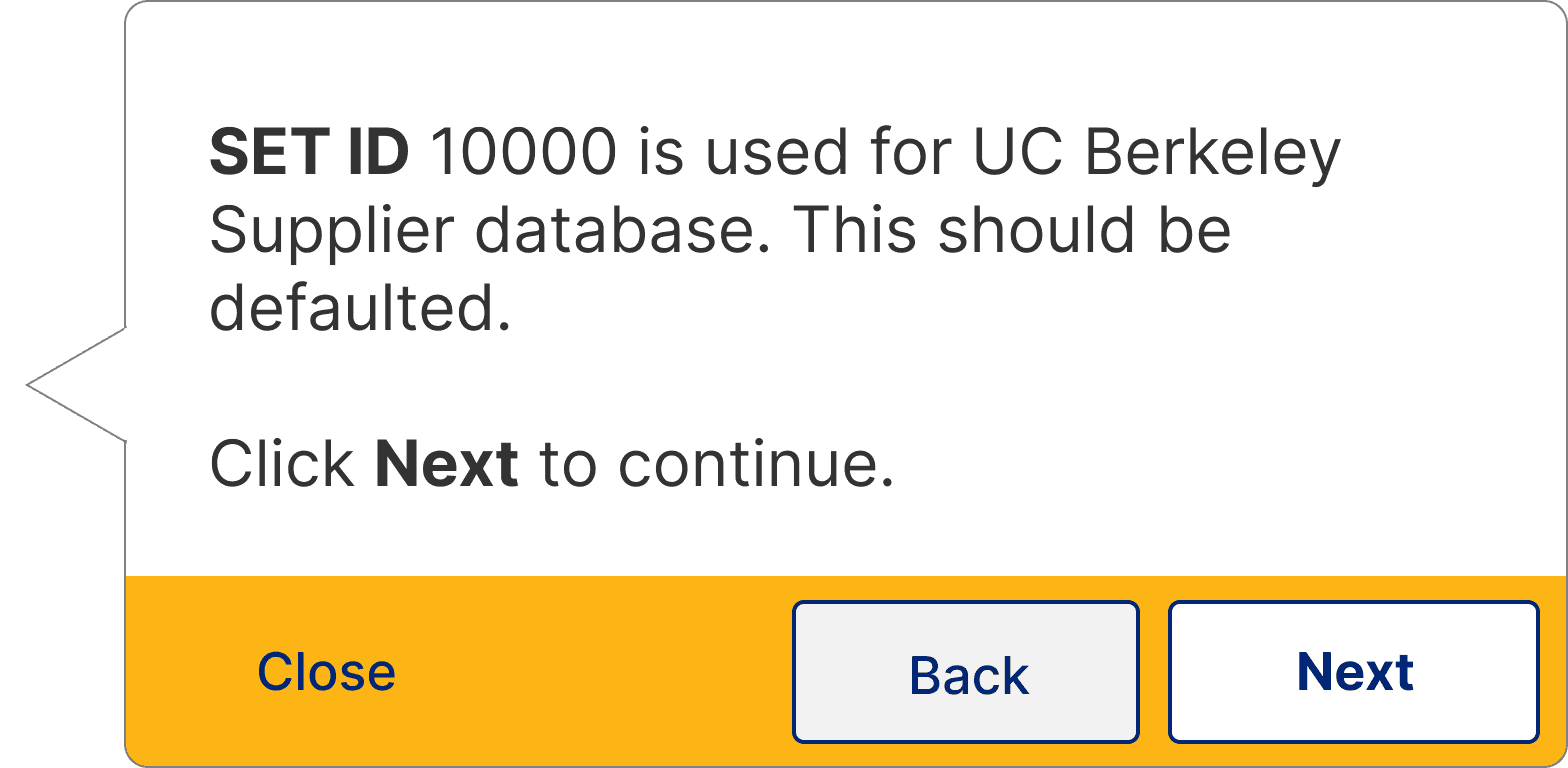
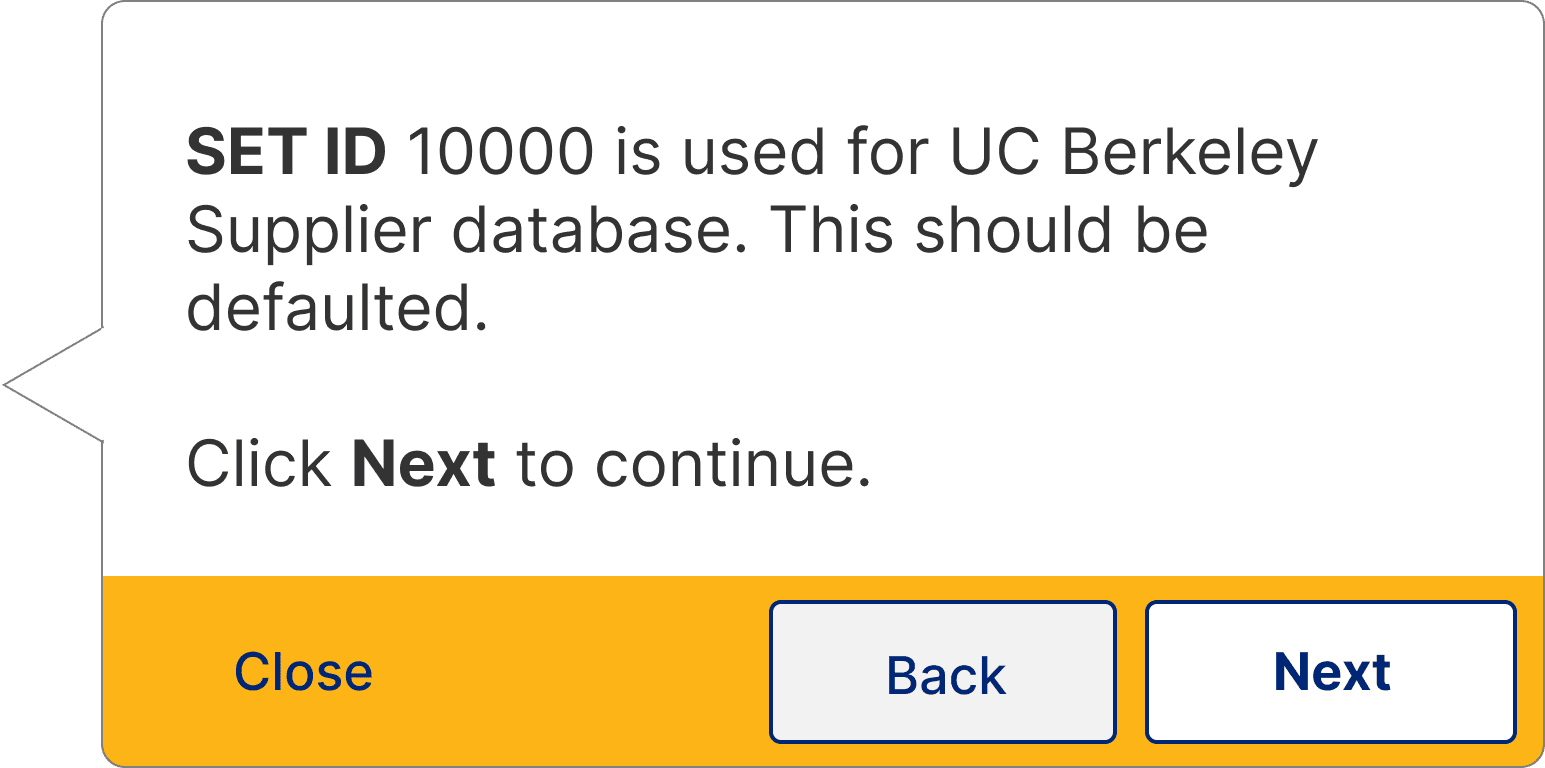
5. Process Guide panels that walkthrough tasks
Problem Statement
How might we design a guide system that is easily accessible, quick to learn, and engages users with timely help?
To align my team with the desired project outcomes, I identified the following goals for my team to focus on throughout our process:
Learn how to best engage users with the DAP
Discover roadblocks to DAP usage
Understand how users learn about the DAP
Identify ways to make process guides efficient
Style the DAP to match campus branding
Usability Testing
Due to a tight project timeline, we dove straight into usability testing, leaning on SMEs to write two process guides to test
Because the larger expenses system implementation was dependent on this guide system implementation project, we were crunched for time. To efficiently set up the guide system, we determined that SMEs on the BFS and BearBuy teams would be best suited to write two process guides to test on each system due to their familiarity with typical financial workflows.
I aligned my team on our project focus with research questions touching on the discoverability and learnability of the guide system
In line with my goals for the project, I wrote the following research questions to guide my method for our usability tests.
How do users discover and engage with the guides?
How are users able to view and use a list of guides to choose from to accomplish their task?
How familiar and comfortable are users with installing and maintaining browser extensions?
Do users recognize the guide system as a trusted source of relevant information?
Though we had limited time for design recommendations before testing, we implemented a few initial changes to optimize findings
Although we were unable to work with SMEs through the entire process guide design before testing, we advocated for a few assumptions and recommendations about user behavior that had the potential to help us dig deeper into our participants' experiences.
Assumption #1:
Users will need help in discovering the guides and browser extensions.
We worked with developers to implement an initial panel announcement introducing the DAP to help catch the users' attention.
Assumption #2:
Users are more likely to trust new help systems when they reflect familiar campus branding.
I coordinated with the campus branding team to attain brand assets to insert in guide elements and gain user trust.
I organized and conducted virtual usability tests with 9 participants from across campus
To test the guide system on both Berkeley Financial Systems and BearBuy, we coordinated with technical teams to test two process guides per system.
Since staff are the main users of both systems, I scheduled sessions with nine staff members in different departments across campus. I wrote the test protocol and facilitated most sessions.

I took an inductive approach to data analysis, leveraging AI tools in my process
Due to how isolated each guide element and its usability assessments were, I utilized an inductive tagging method to sort through my notes via Dovetail.
Findings & Recommendations
I responded to user feedback with design recommendations
Finding #1:
Brighter widgets were more noticeable and thus users clicked on them more.
Participants had an easier time noticing the widget when the color was brighter.
Recommendation #1:
Style widget with brighter colors.
Finding #2:
Accessing the guide menu was easy, but its contents were confusing.
Although participants were able to access the guide menu through the widget, they were confused by the guide list.
Recommendation #2:
Properly name and organize guides to help users find the guides they need.
Finding #3:
Guides launching upon opening tested well, but didn’t address the guide system learning curve.
Participants liked the guides launching upon opening, verifying our assumption, though some still had trouble finding a guide after closing one.
Recommendation #3:
Display Welcome Guide Panel the first 3 times users login to teach them about the guide.
Finding #4:
Users had difficulty focusing on the highlighted page elements due to the prominence of the guide panel buttons.
Some participants had trouble splitting their attention between the highlighted page element and the guide panel buttons.
Recommendation #4:
Customize color of buttons to appropriately communicate primary or secondary actions.
View full research report
Theme
I used organizational branding guidelines to curate a theme for the guide system
To style the guide elements, I used UC Berkeley's branding guidelines along with our findings to determine how the guide system should look and feel.
Style Guide
To inform the future authoring process, I documented guide system UX best practices
Because there would be many guides written in the future that my team and I did not have the ability to oversee, I created a style guide in collaboration with guide authors for future authors to reference best practices for new guides. This included styling tips like font sizes in process guide panels, as well as interactions like when to use a blinking animation, or how to configure settings to visually lead users through the golden path.


Outcome
Setting the UX standard for guide systems for the rest of campus
With our UX input, Berkeley Financial Systems and BearBuy were able to implement a more usable guide system in preparation for a new Expenses system. These two campus teams intend to use this DAP implementation as an example for the rest of campus, so that other campus departments can also implement usable guide systems for complicated workflows.
Through collaborating cross functionally with teams across campus and beyond, I was able to lead my team in creating a UX impact on the new system, bring up the baseline for usability, and provide UX guidelines for future DAP implementations on campus.
Learnings
What did I learn from this project?
Although style guides are used to maintain UX standards, they are a collaborative effort.
Since I was not involved in authoring the guides, I relied on the authors to advise me on what works for them in their process, and noted down how I could incorporate those tips while maintaining UX standards.
With tight timelines, compromises are necessary.
Though I was able to test with many users, I was not able to test every guide with every user due to some last minute bugs. However, since I was able to test most of the workflows in order to understand the general usability of the DAP, I was still able to provide findings and recommendations that had plenty of evidence to back them up.