
Overview
The Forms Center allows students and staff to submit, update, and approve campus forms. I led the design and research process to shape this new forms experience for campus users.
Role
Lead UX Designer
Created design for new Forms Center dashboard. Conducted usability testing on design with two user populations. Implemented design recommendations and handoff to developers.
Team
Myself, 2 Business Systems Analysts, 1 Developer
Timeline
4 months
Context
eForms are currently scattered across student information systems, with no centralized way for a user to view all their forms
GT eForms is a form technology for PeopleSoft, a software application used at Berkeley to hold student and staff data.
At Berkeley, eForms are accessed with outdated and inefficient methods, through either a search function or the long list of eForms in the GT eForms Work Center.
Problem Statement
How might we design a new streamlined experience for users to access, view, submit, and update their eForms in one place?
The Current situation
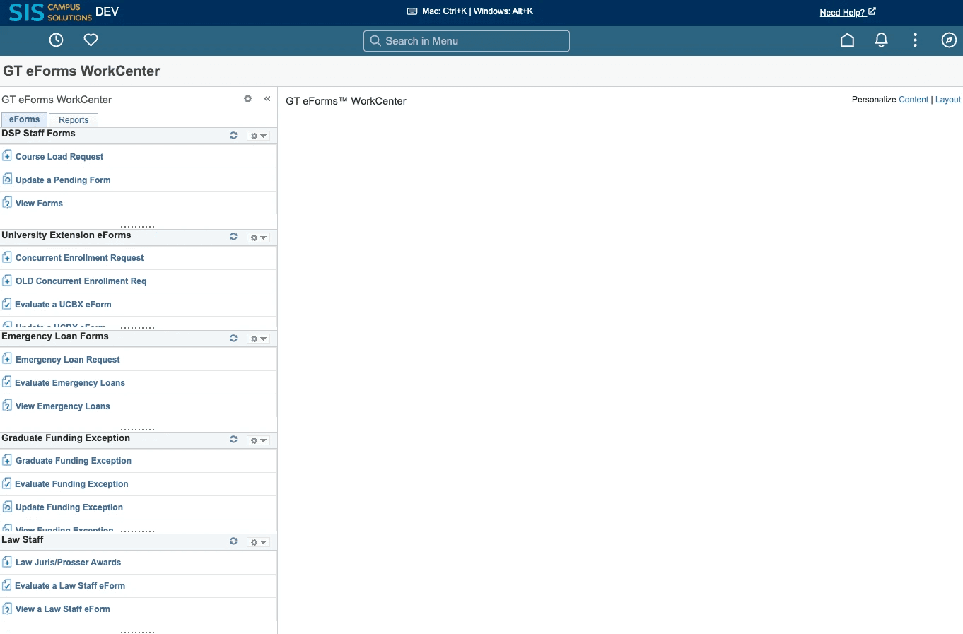
Staff are forced to use an unpleasant and convoluted menu to find their eForms
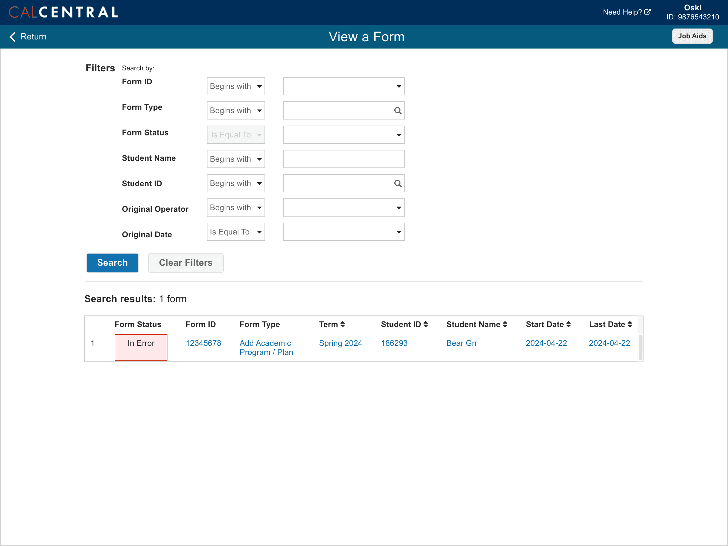
The eForms Work Center contains all the eForms any staff member can access, however, the eForms are presented in a long and tedious list. This list has no filters, so often times users see eForms that are irrelevant to their role.
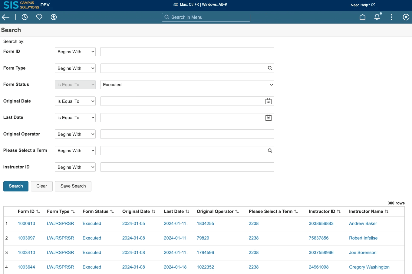
Students are limited to a "search" feature to access their forms
The only way for students to access their eForms is through search, which presents unclear and jargon-y search criteria.
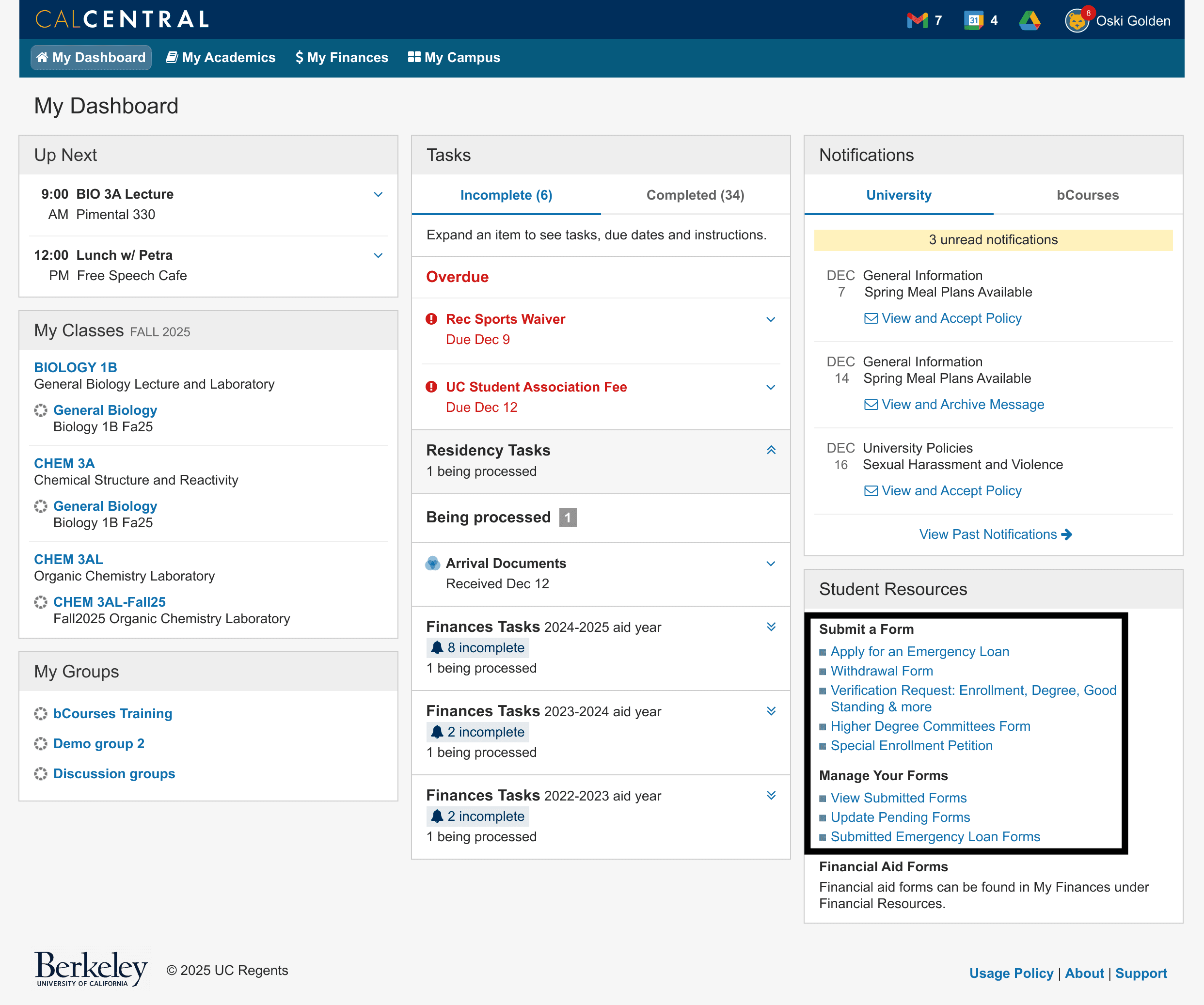
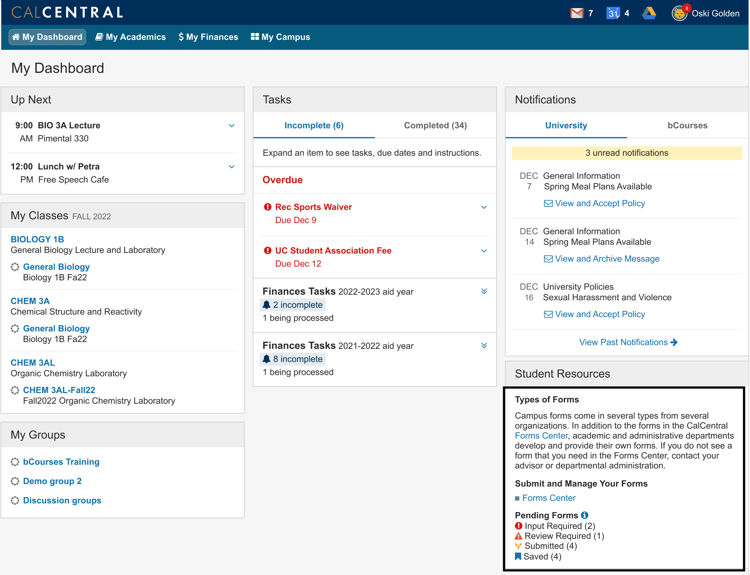
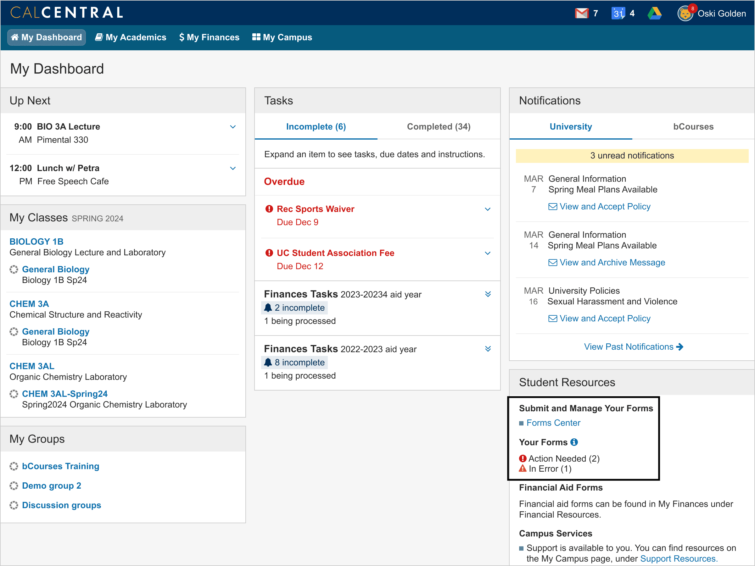
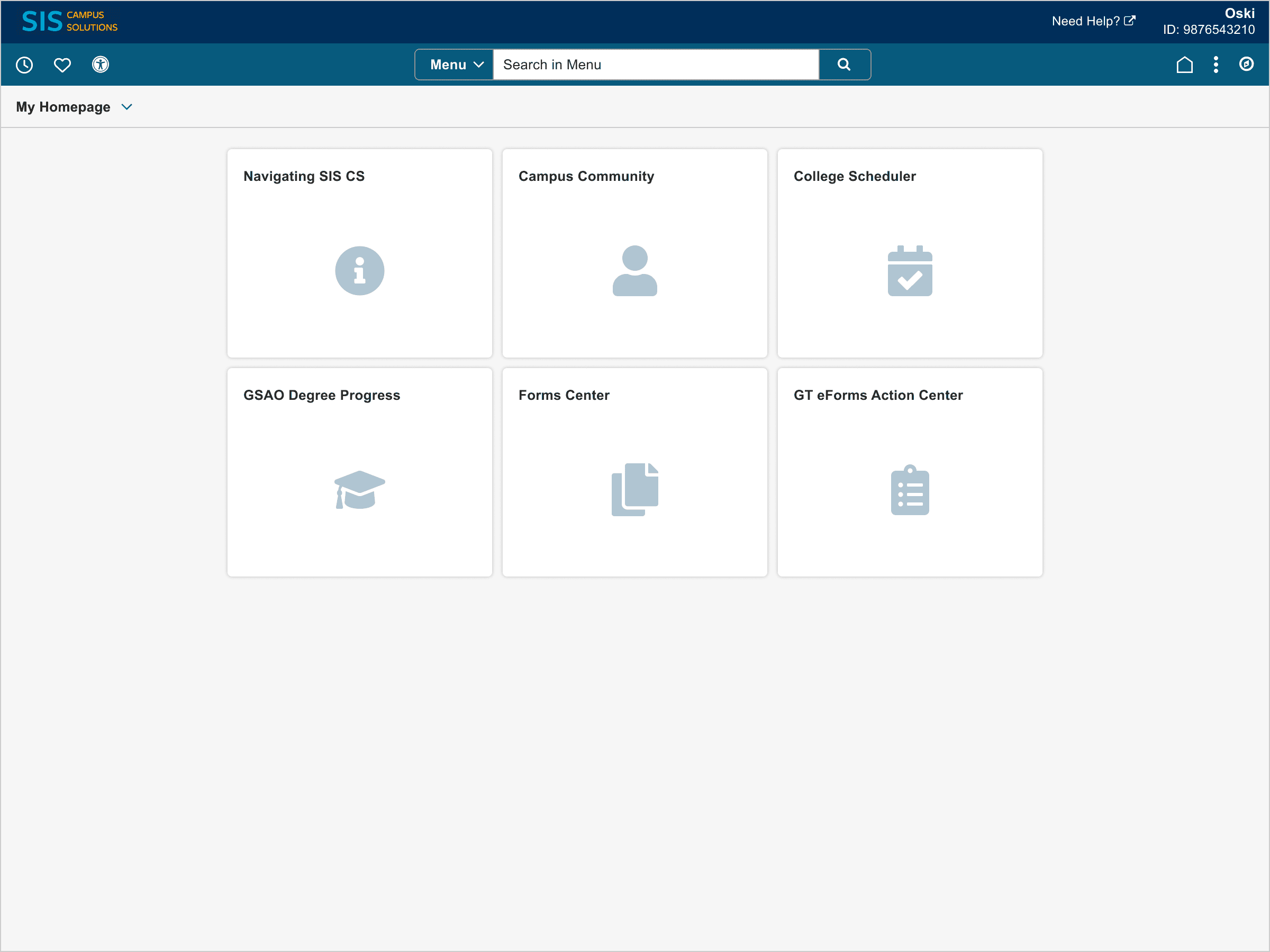
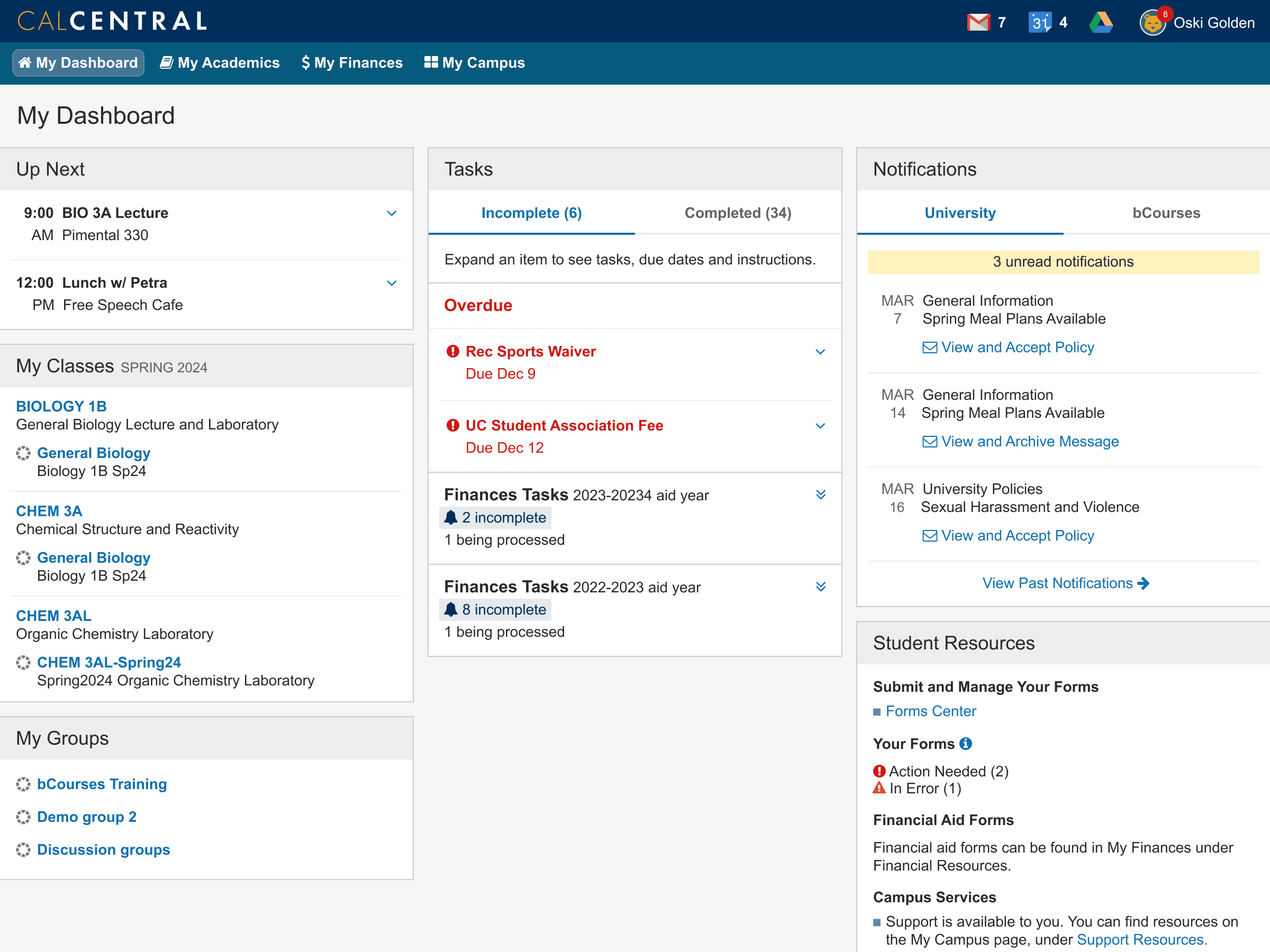
Accessing forms through CalCentral, the student portal, is unnecessarily messy
Both students and staff access forms through CalCentral, the student portal. However, there are multiple links to access forms and are not clearly distinguished.
CalCentral: Staff
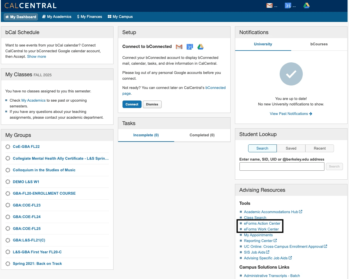
CalCentral: Students
Generative Research
To dig into the eForms experience, I talked to students and staff about how they currently use eForms
Staff have the additional workflow for approving eForms and thus use eForms at a much higher frequency. Knowing this, I determined the need for two different user flows: one for students, and one for staff.
Due to limited resources for research, I conducted a focus group with staff to obtain information in a short time span, and collected information from our team's student interns for an overview of their eForms experience.
Findings from Staff Focus Group
Staff access eForms from various methods, mainly CalCentral, Campus Solutions (Student Information System), or email notifications.
Usage of Action Center (batch updates) varies, but those who use it rely on it heavily.
Filters are essential in eForm workflows.
Findings from Conversations with Students
Students only expect to find eForms on CalCentral.
Students don't often use eForms, and will typically have 0 - 5 eForms at a time.
Design Process
I focused on information architecture and explored different form and form action categories due to technical limitations on the dashboard structure
Because developers were building the Forms Center in an enterprise system, there was little room for custom development. Thus, I had to ideate within configuration / low code options. I determined that information architecture and wording and categorization of forms would be most important for users to efficiently access the forms they're looking for.
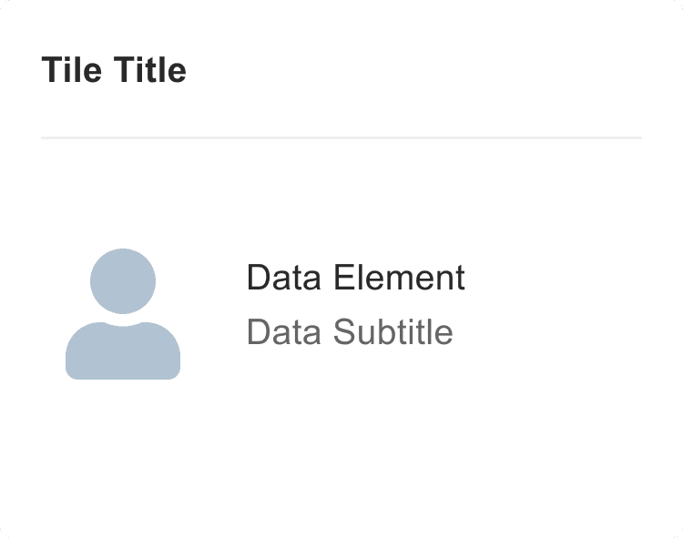
What was available to me were "tiles", which had two width options and included a title, description, and icon, and "badges" on the tile to provide quantitative and descriptive information ties to a form or form category.
Tiles: Regular and Wide
Badges on Tile
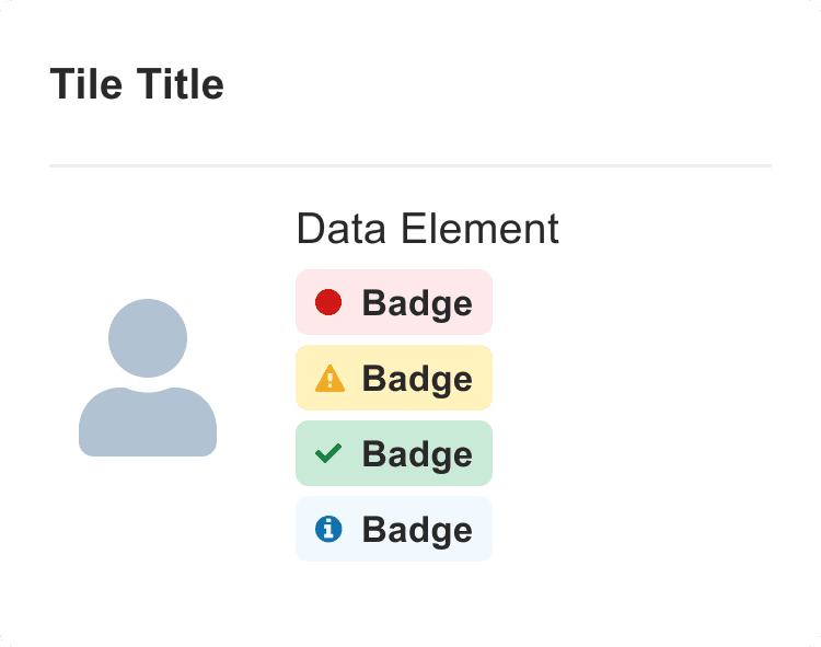
To use each element to my advantage, I explored different tile titles, tile descriptions, and badges according to the workflows of students and staff.
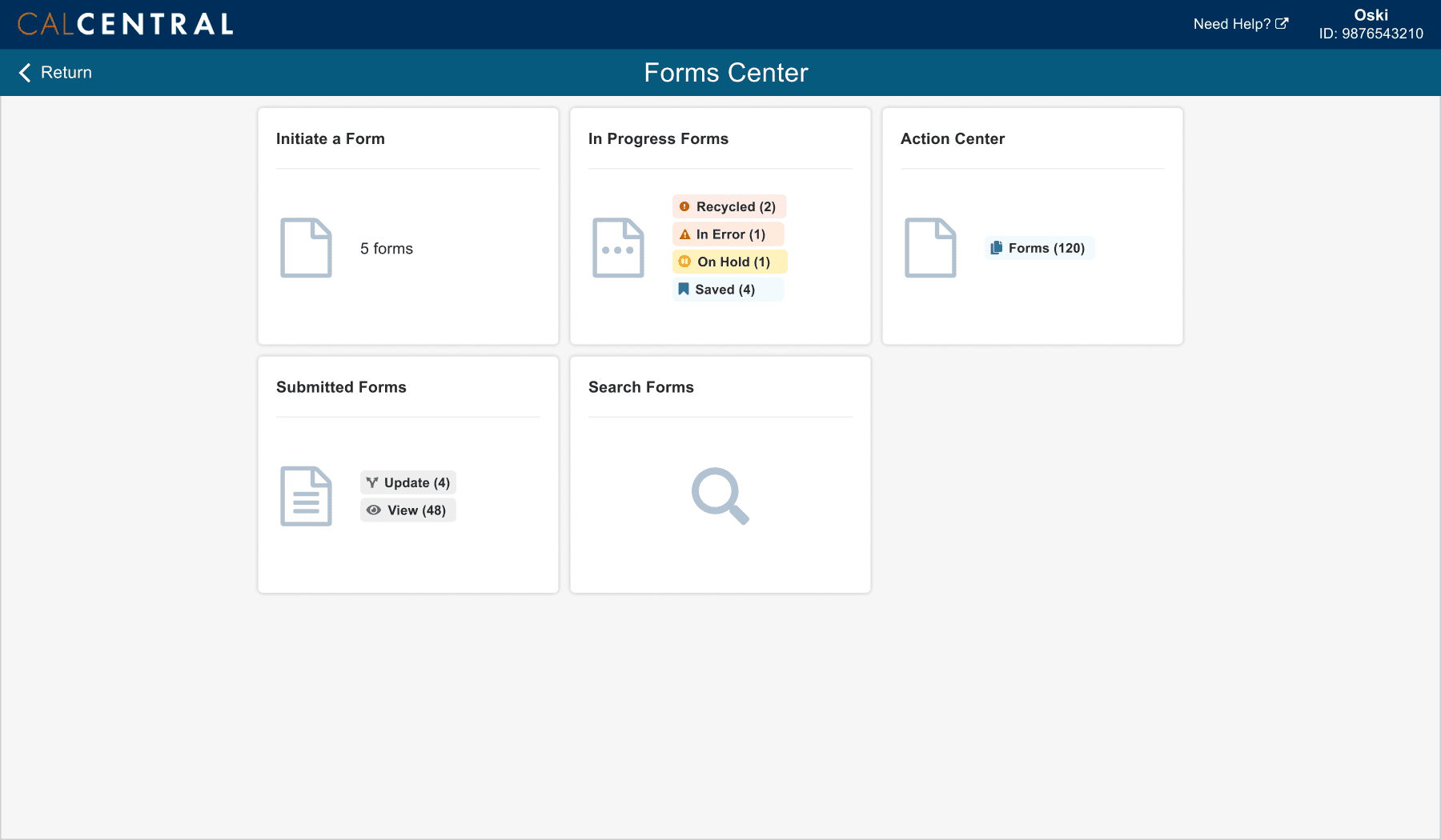
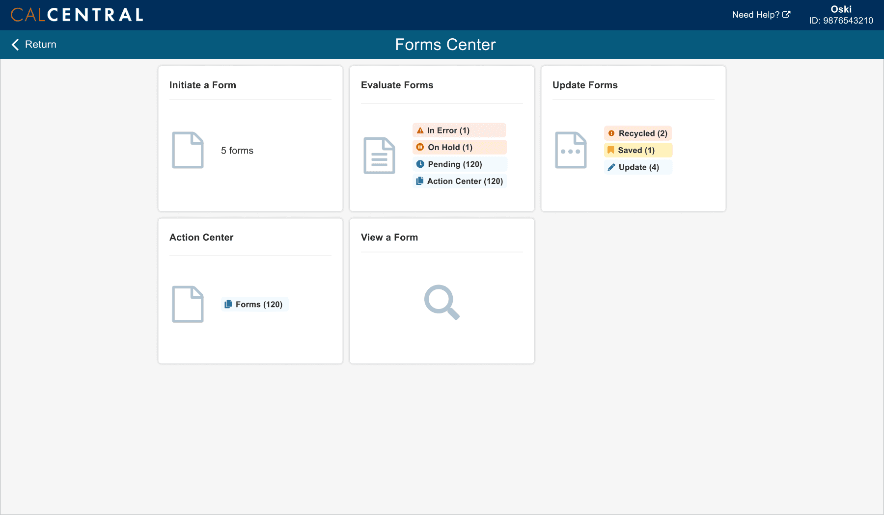
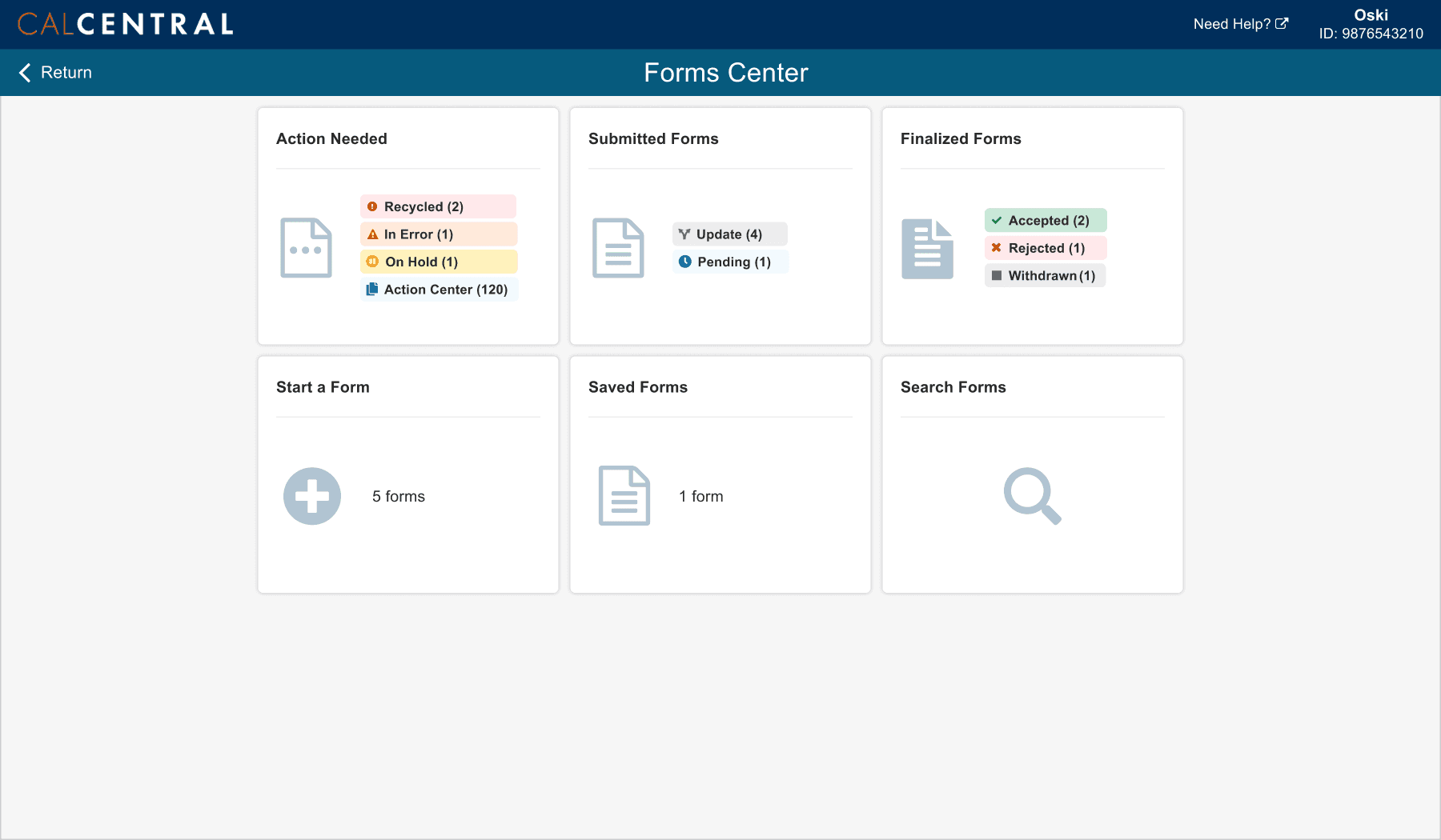
Staff Home Page Explorations

Student Home Page Explorations

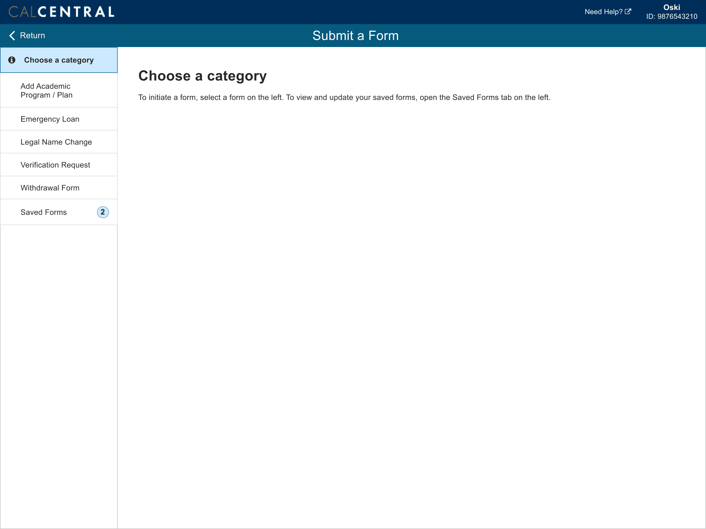
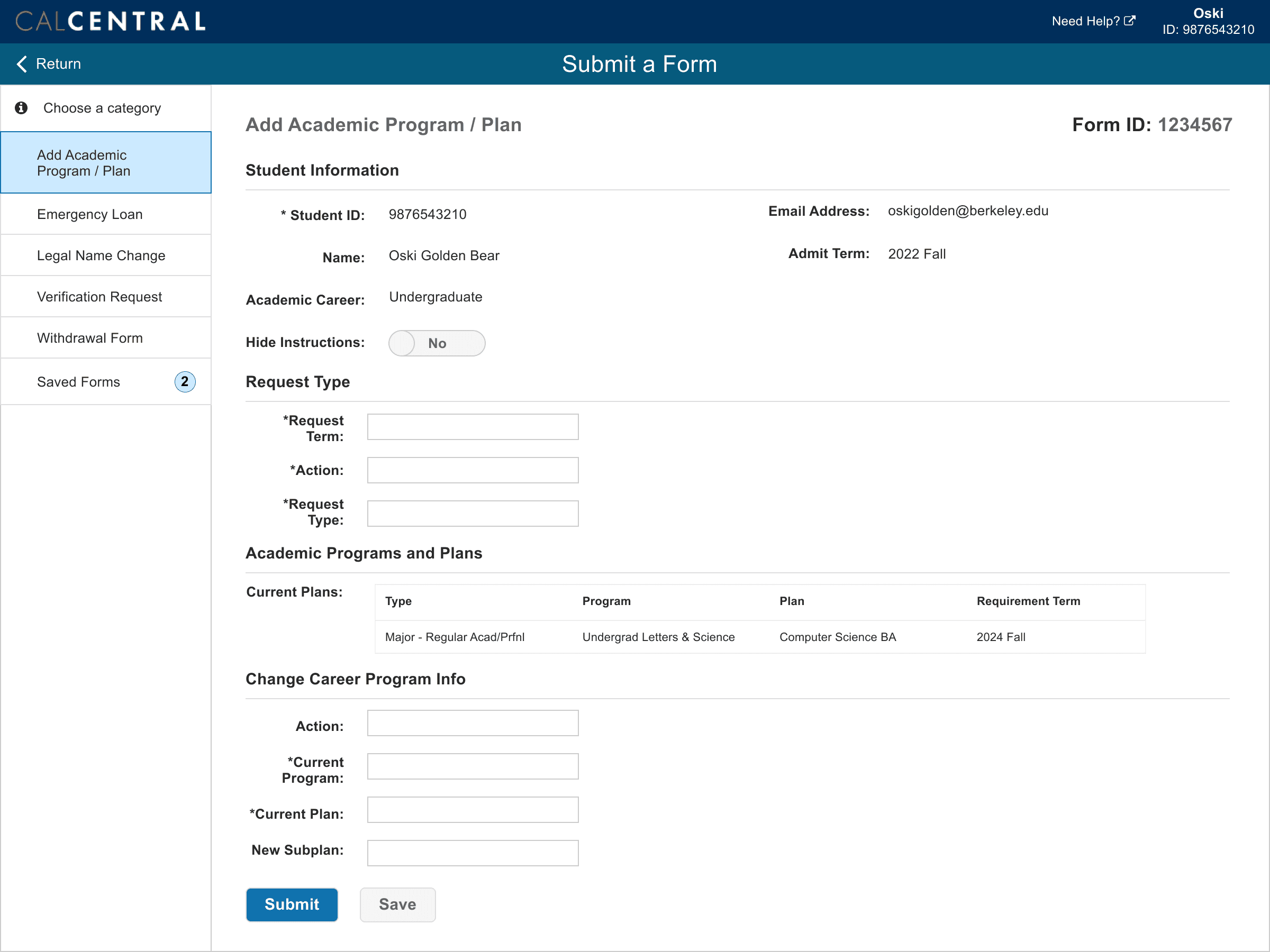
Prototype
Utilizing my research findings, I narrowed down the form categories and designed the flows for students and staff accordingly
After discussing the options with developers and revisiting my generative research findings, I chose the home page options according to what would be most efficient for users while maintaining eForms query limitations and including categories that require a users' attention.
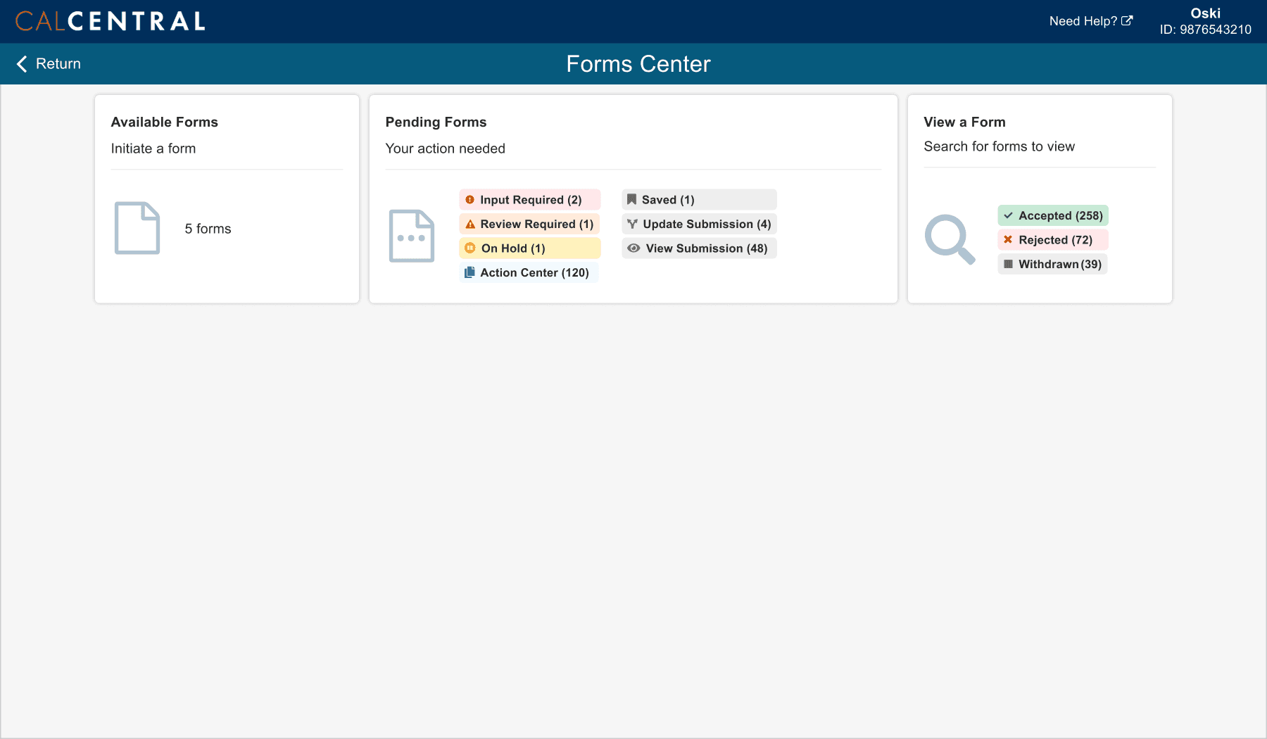
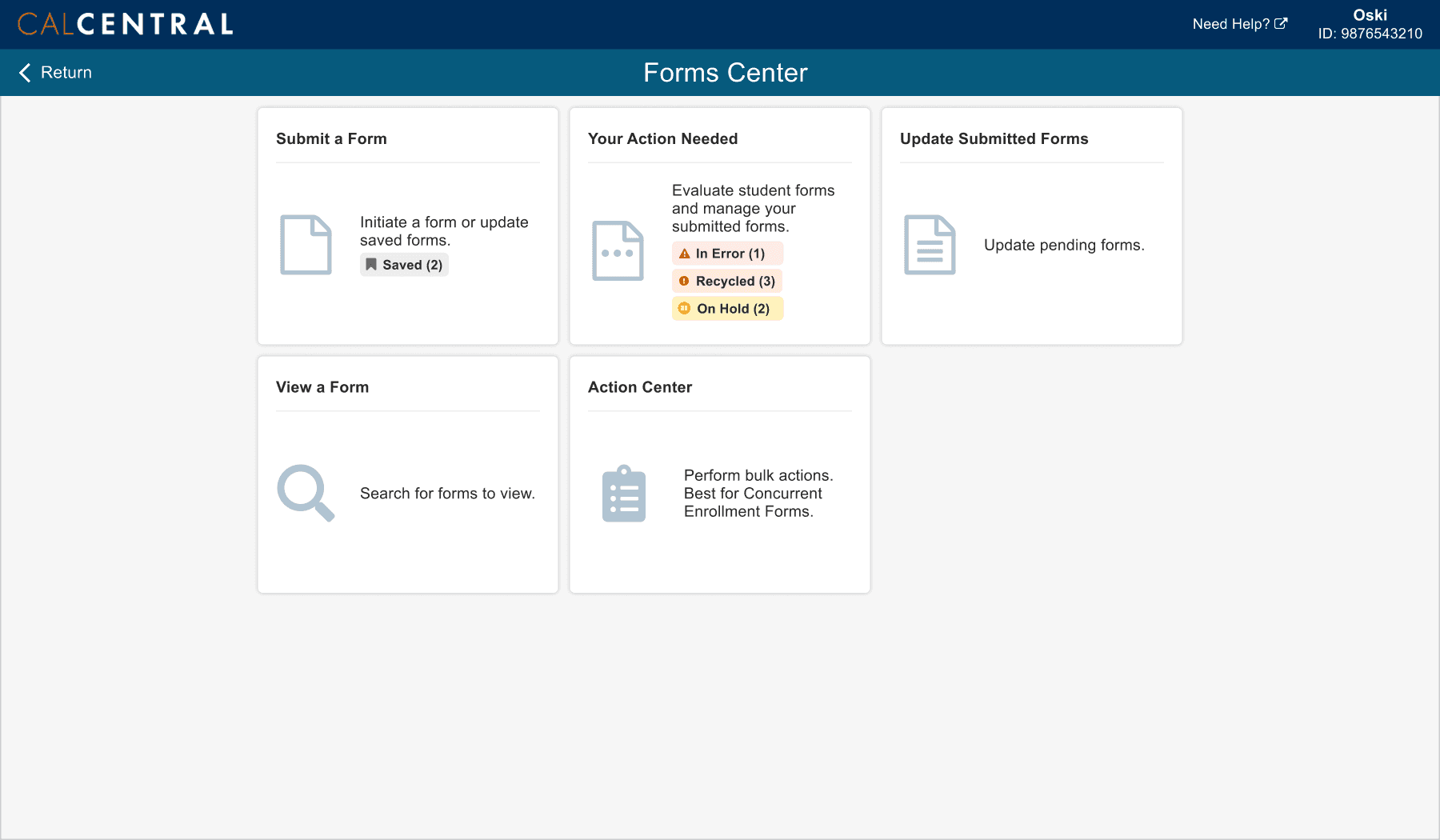
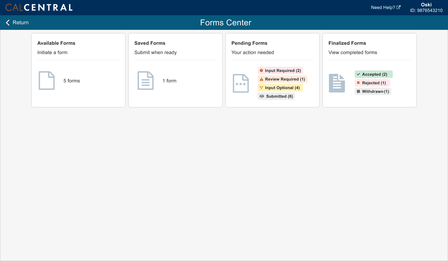
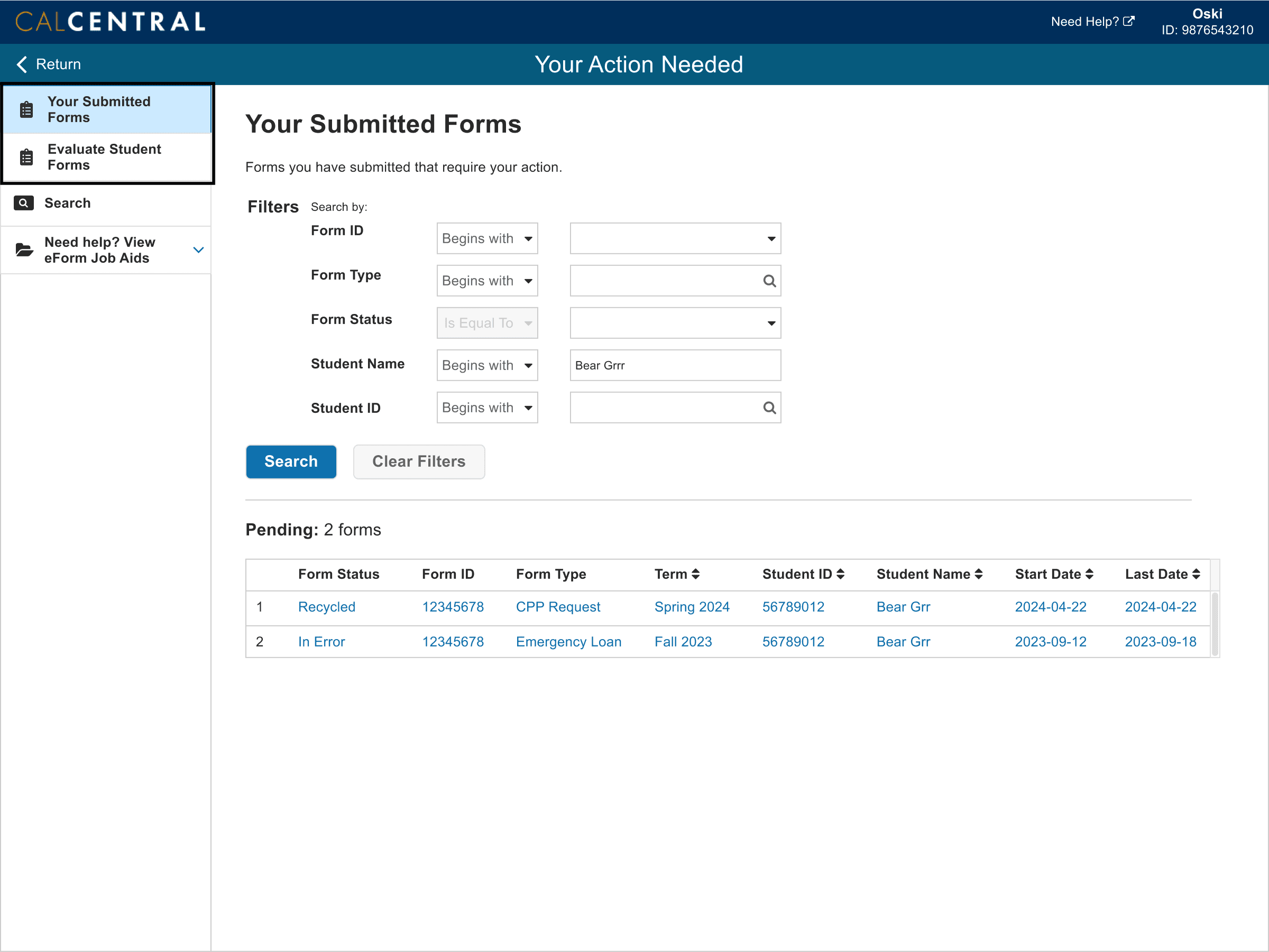
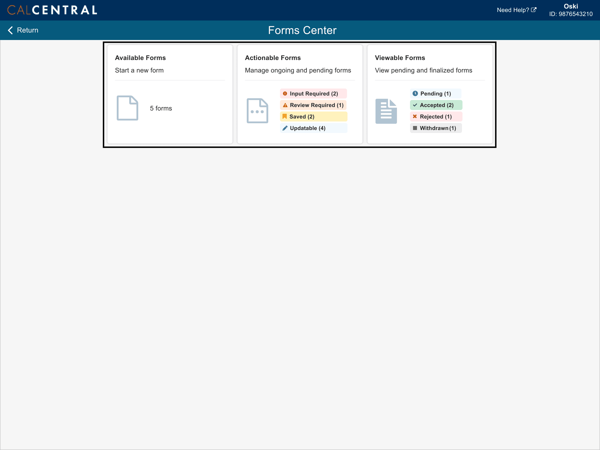
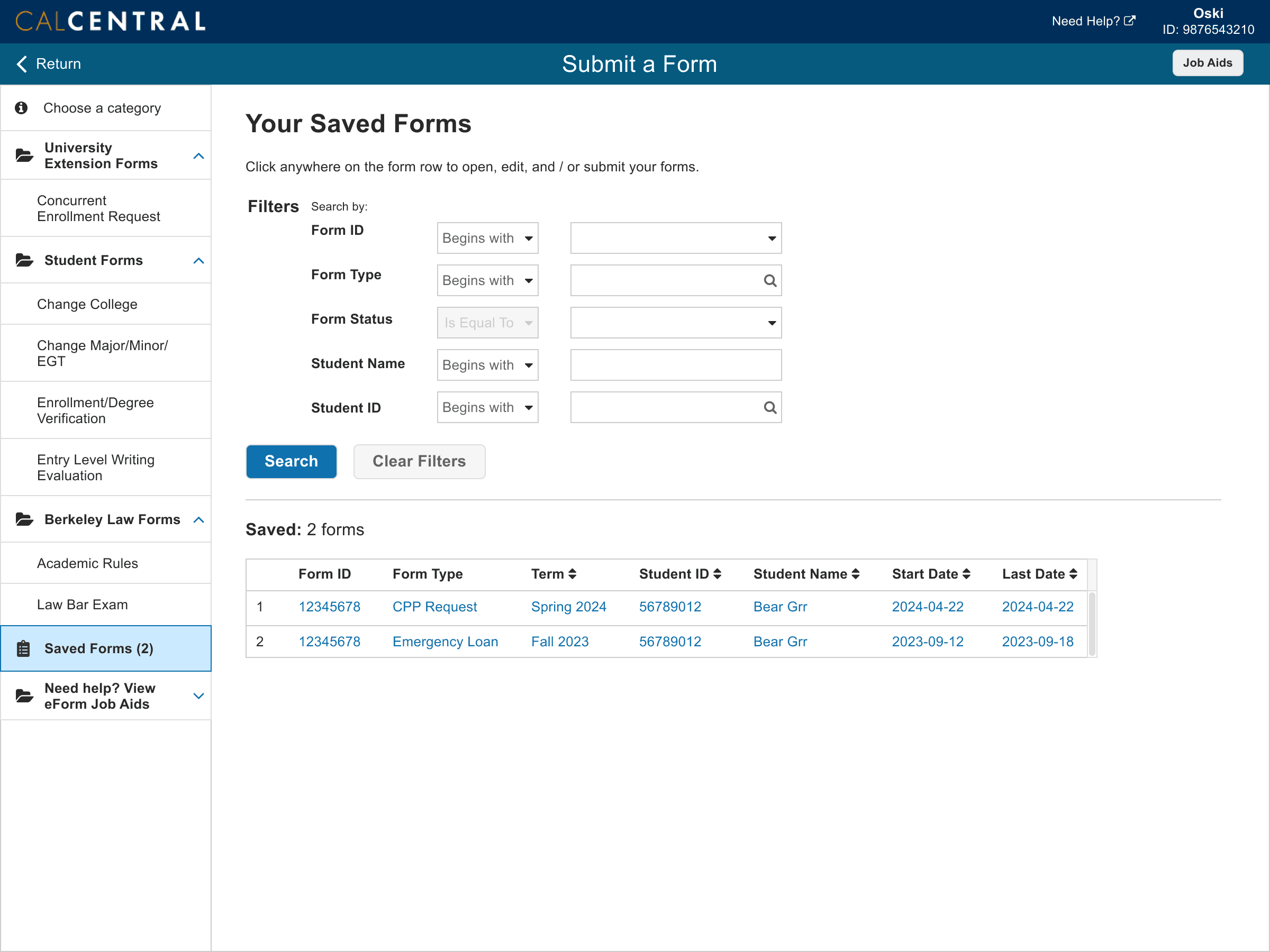
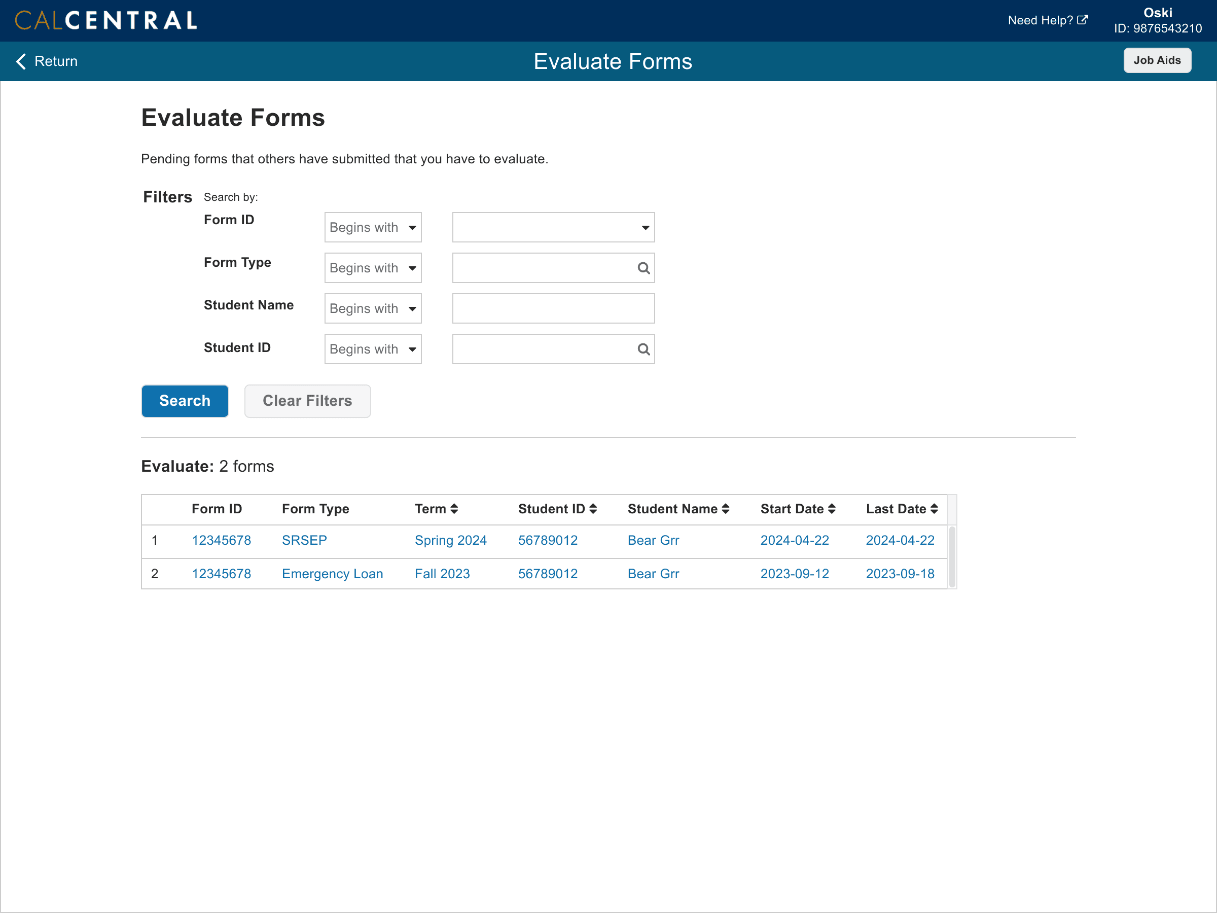
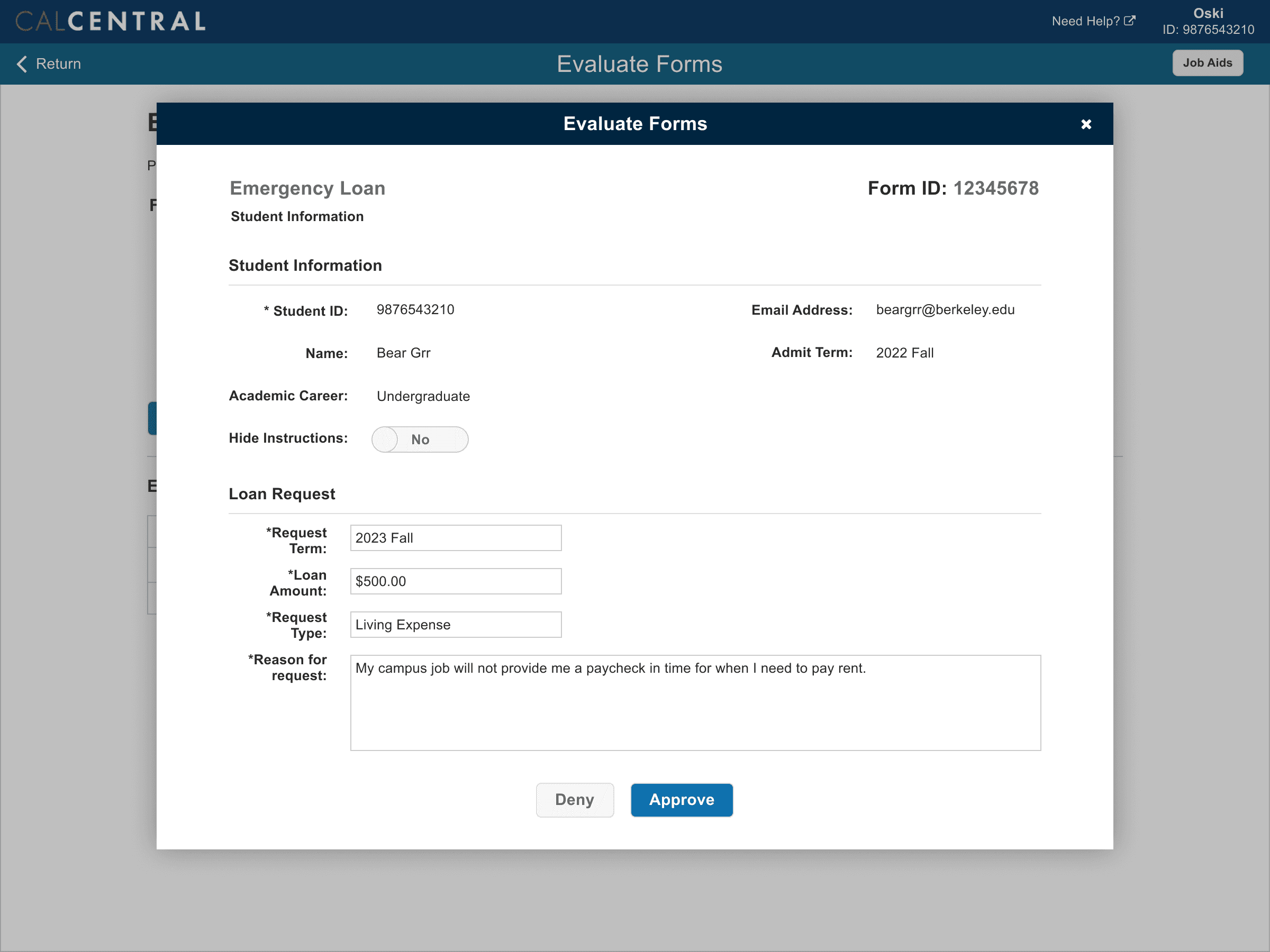
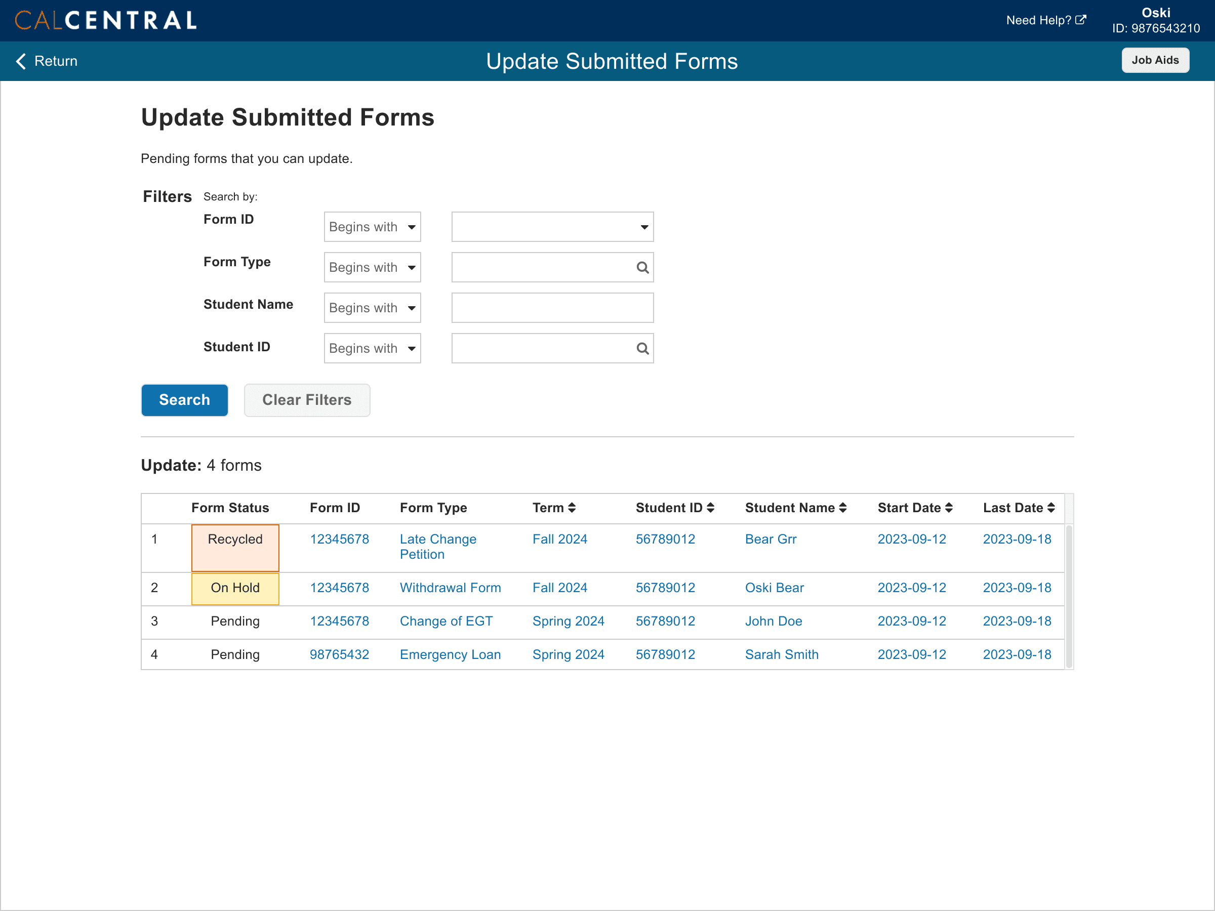
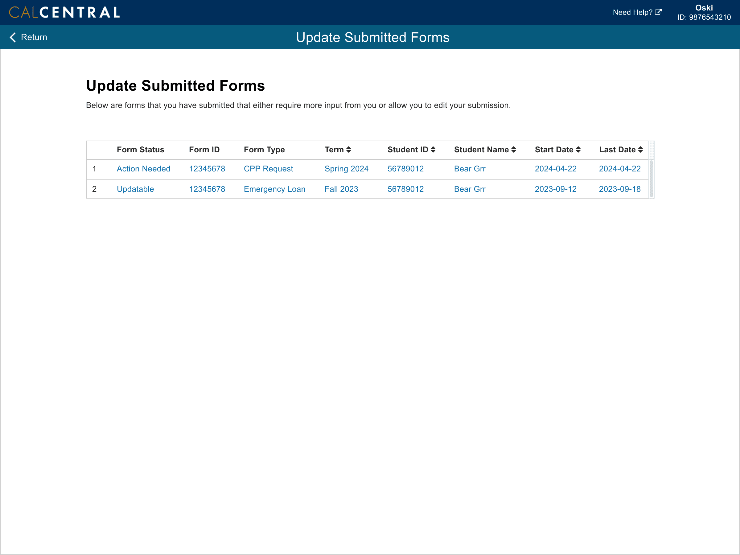
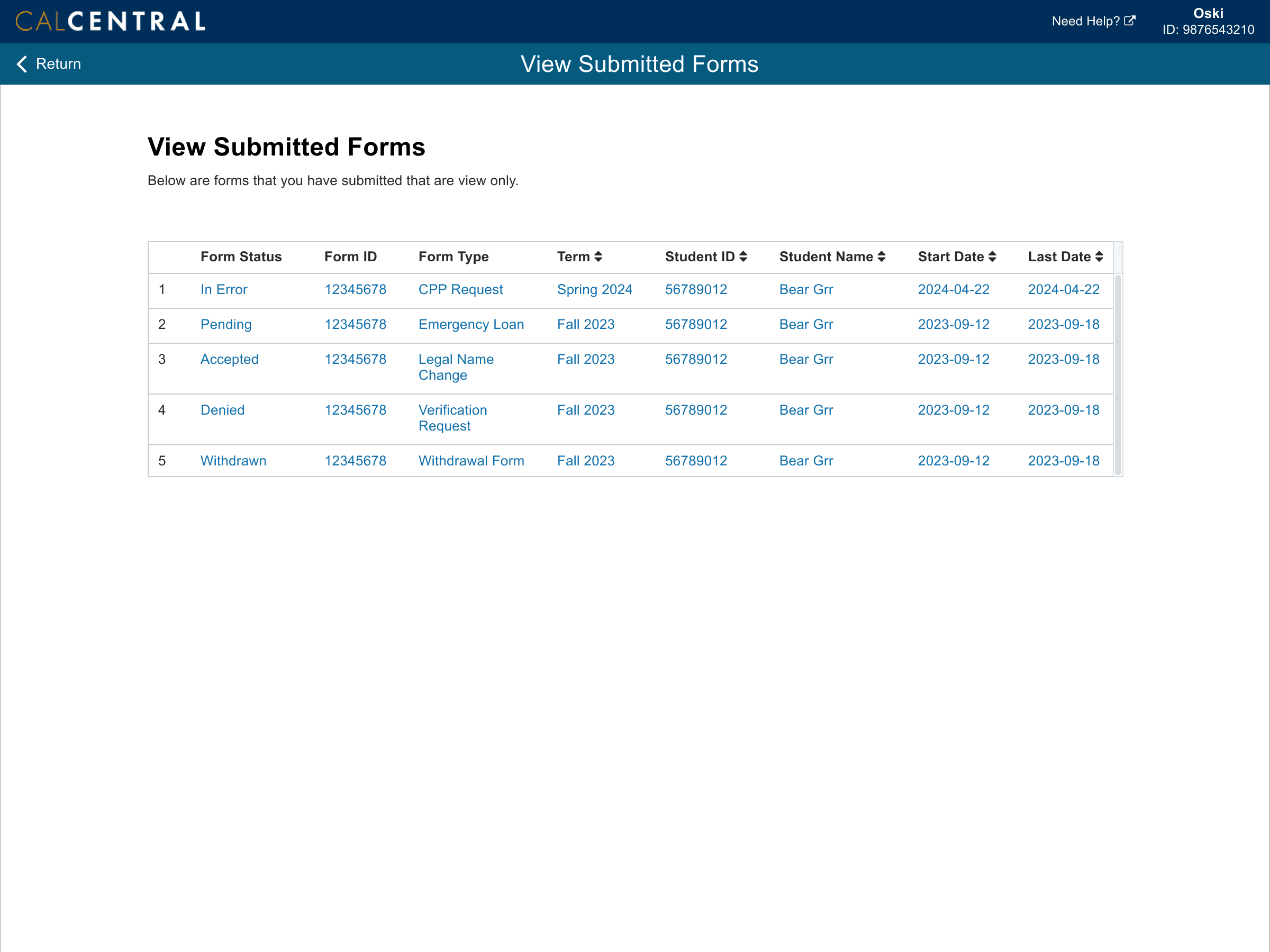
Staff Prototype
I chose the option below based on the most common tasks staff perform on eForms. I intentionally utilized the badges to communicate urgency on certain eForm categories.
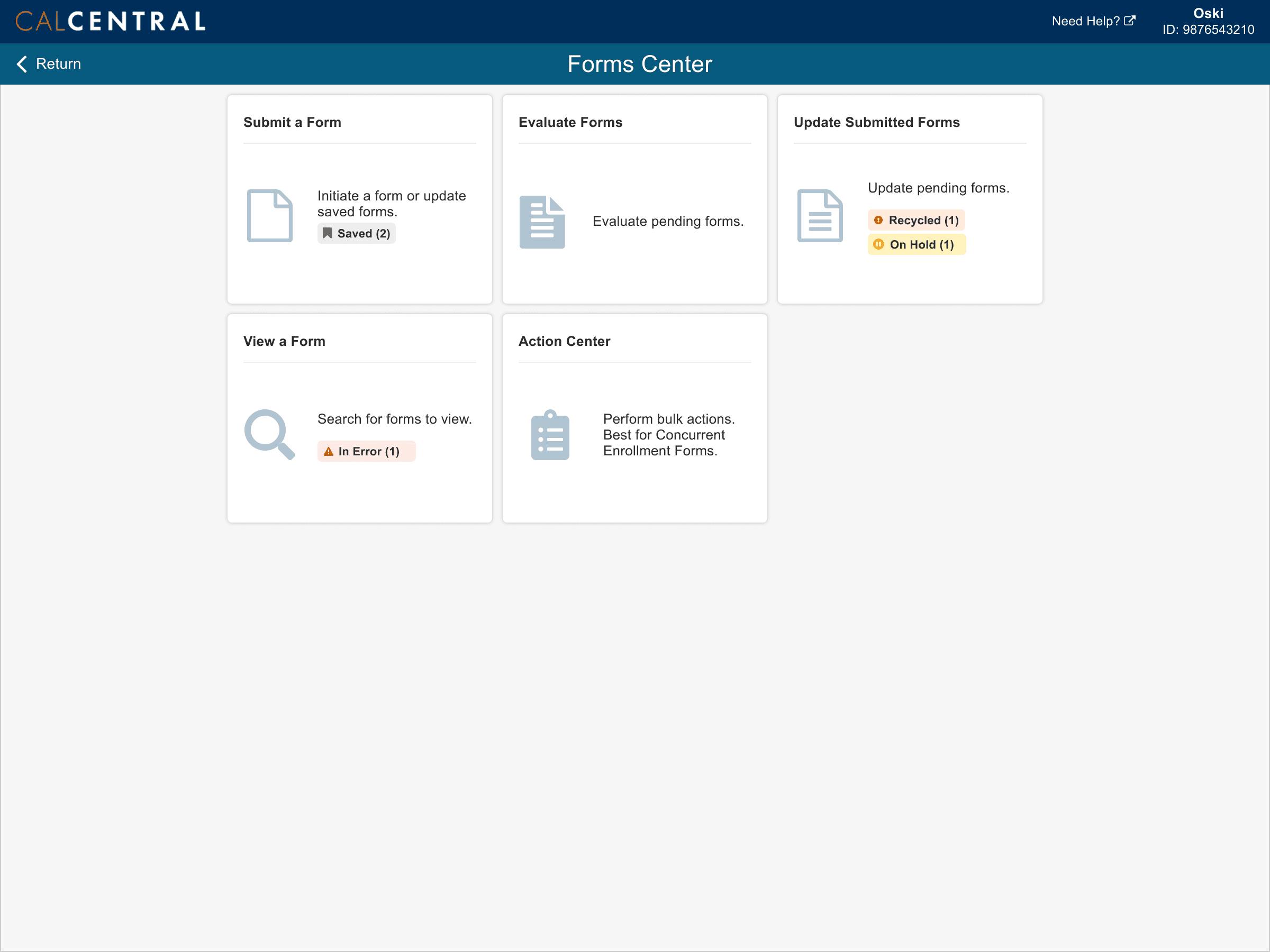
The first prototype iteration included two access points from CalCentral and Berkeley Campus Solutions, which leads to the eForms home page with the above actions available.
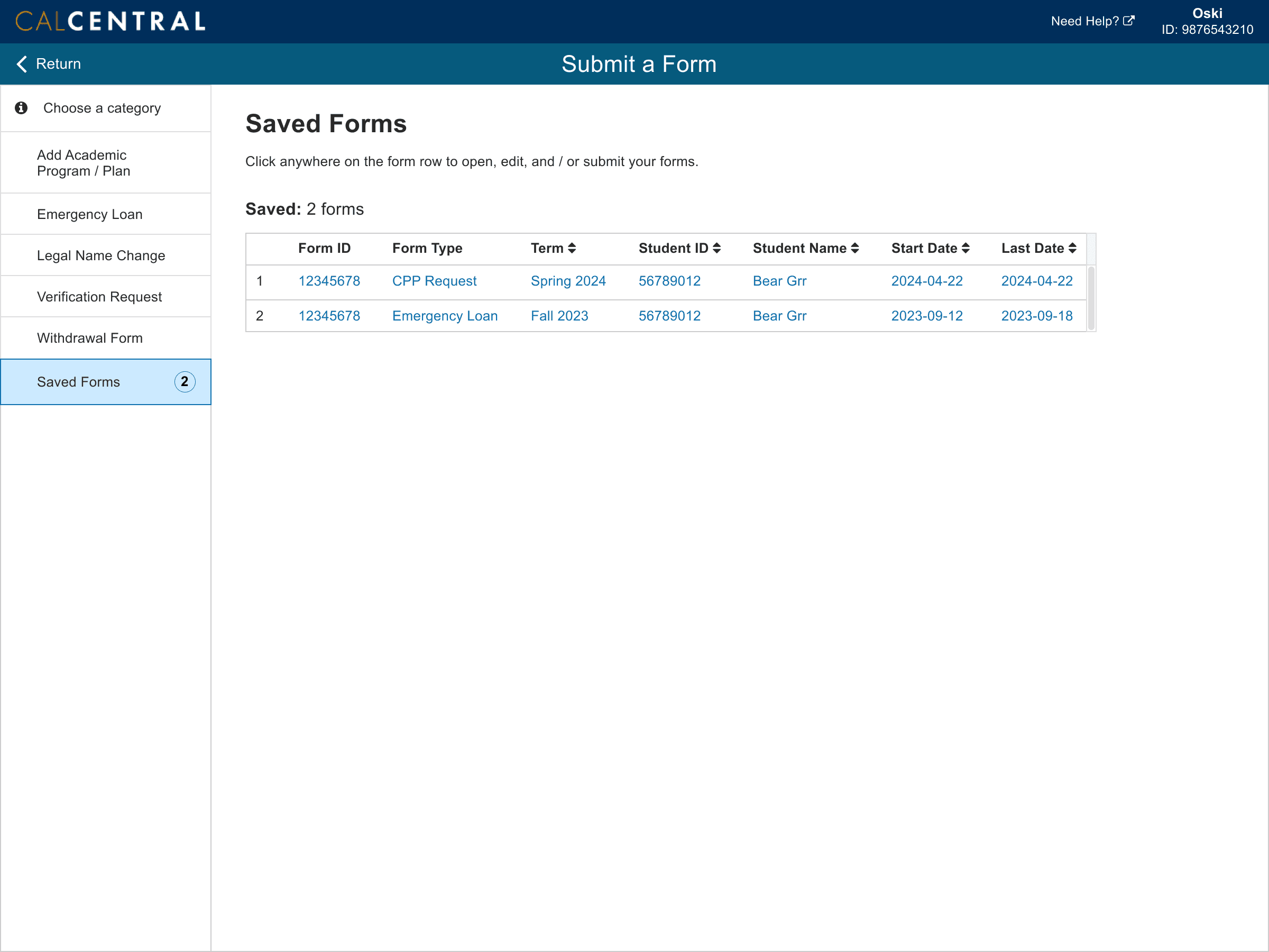
Student Prototype
I chose the option below knowing that students have fewer eForms tasks available to them, and used badges to provide upfront information about their eForms.
The first prototype iteration included one access point from CalCentral and leads to the eForms home page with the above actions available.

Findings & Recommendations
I tested my designs with staff members and students to discover and address usability difficulties
To test my designs, I conducted usability testing with 5 staff and 11 students. Because of the diversity of departments on campus, I performed outreach and recruited a representative group of participants.
Finding #1
Staff liked accessing from both CalCentral and Campus Solutions, accessing Action Center directly without going into the Forms Center and did not require eForm information to be displayed on CalCentral.
Recommendation #1
Remove eForm information on CalCentral and only display Forms Center and Action Center links.
Finding #2
Staff preferred to not have to click on another tab to get to a form category, and feel that form status would be enough for them to differentiate each type of form.
Recommendation #2
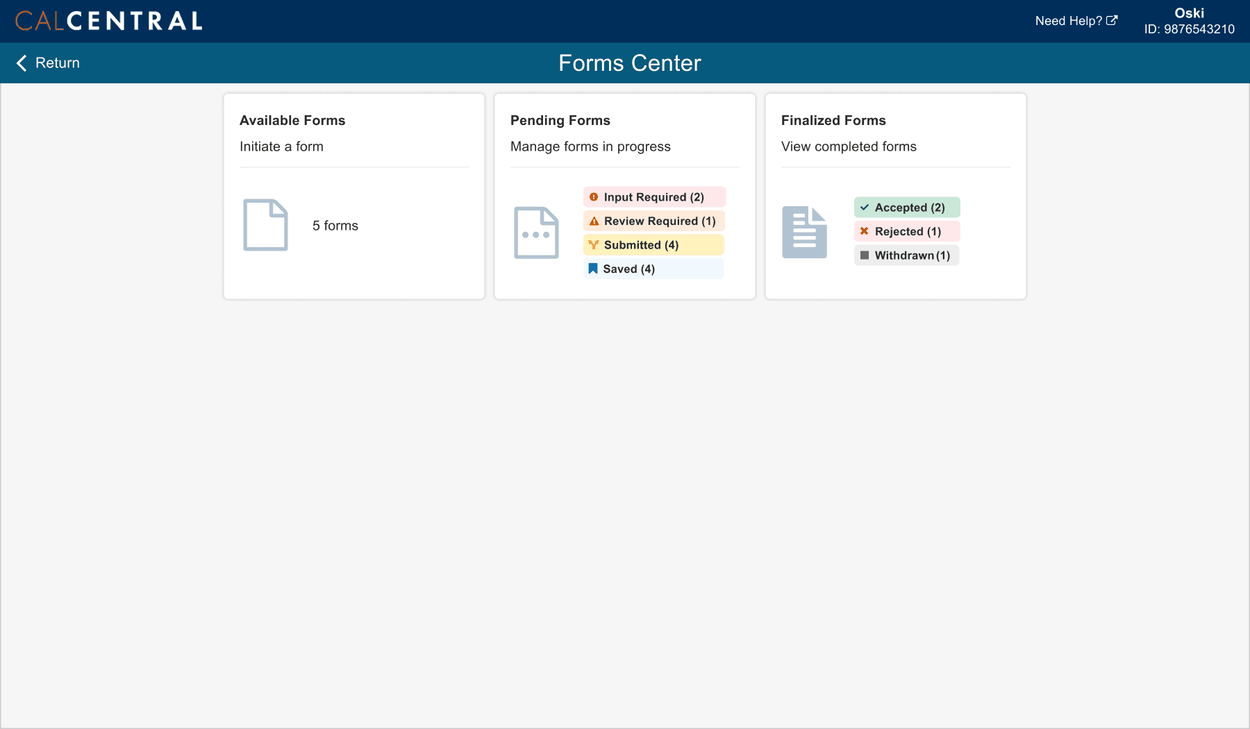
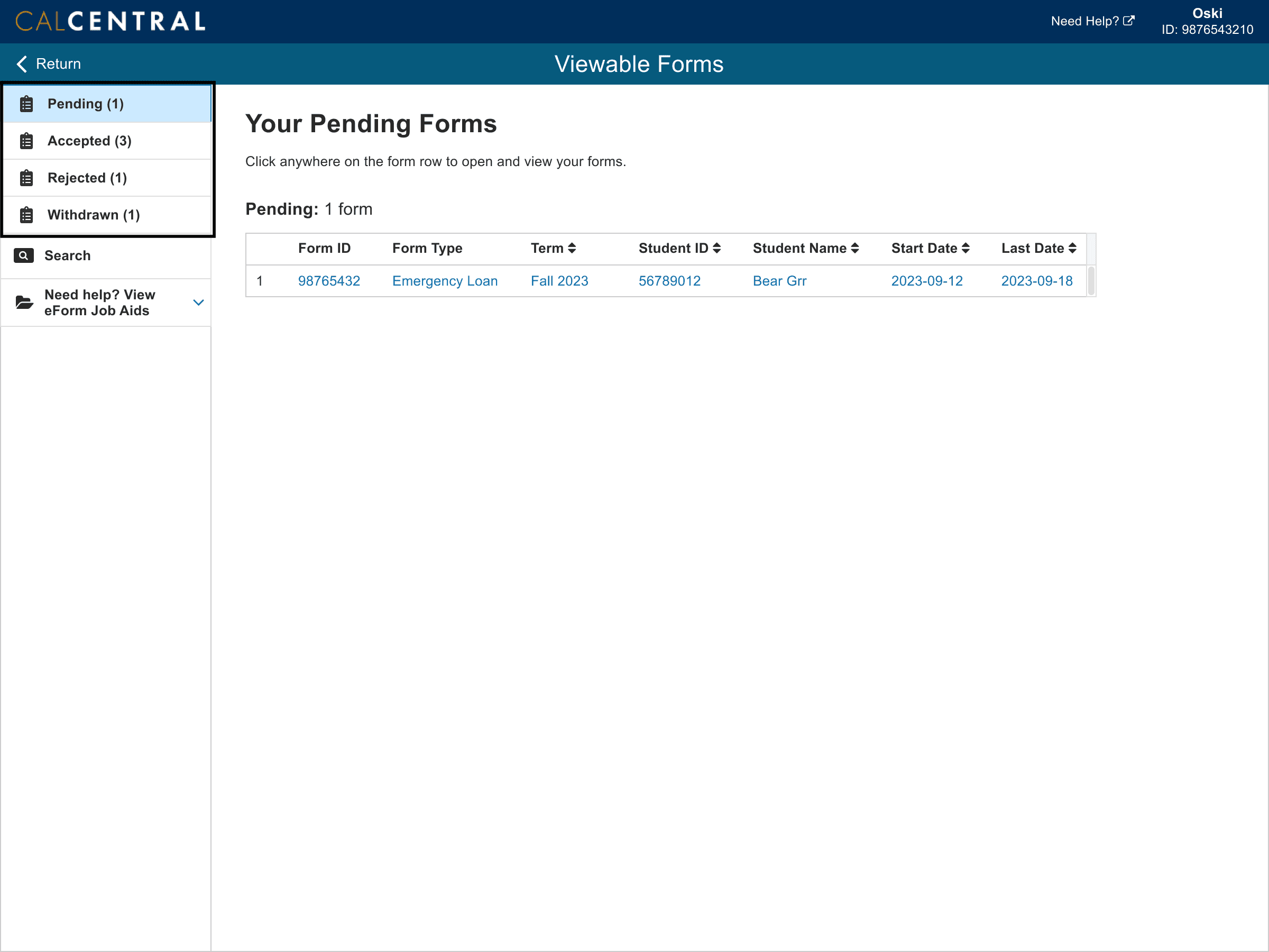
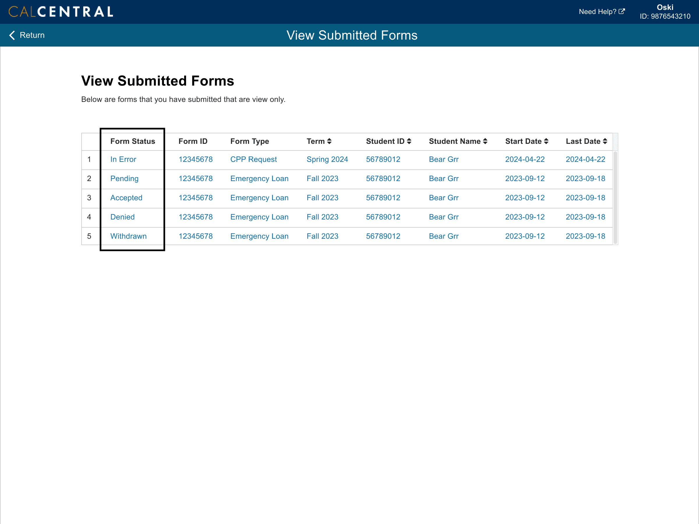
Instead of having different tabs in each tile, display all forms directly in the table with the forms status clearly indicated.
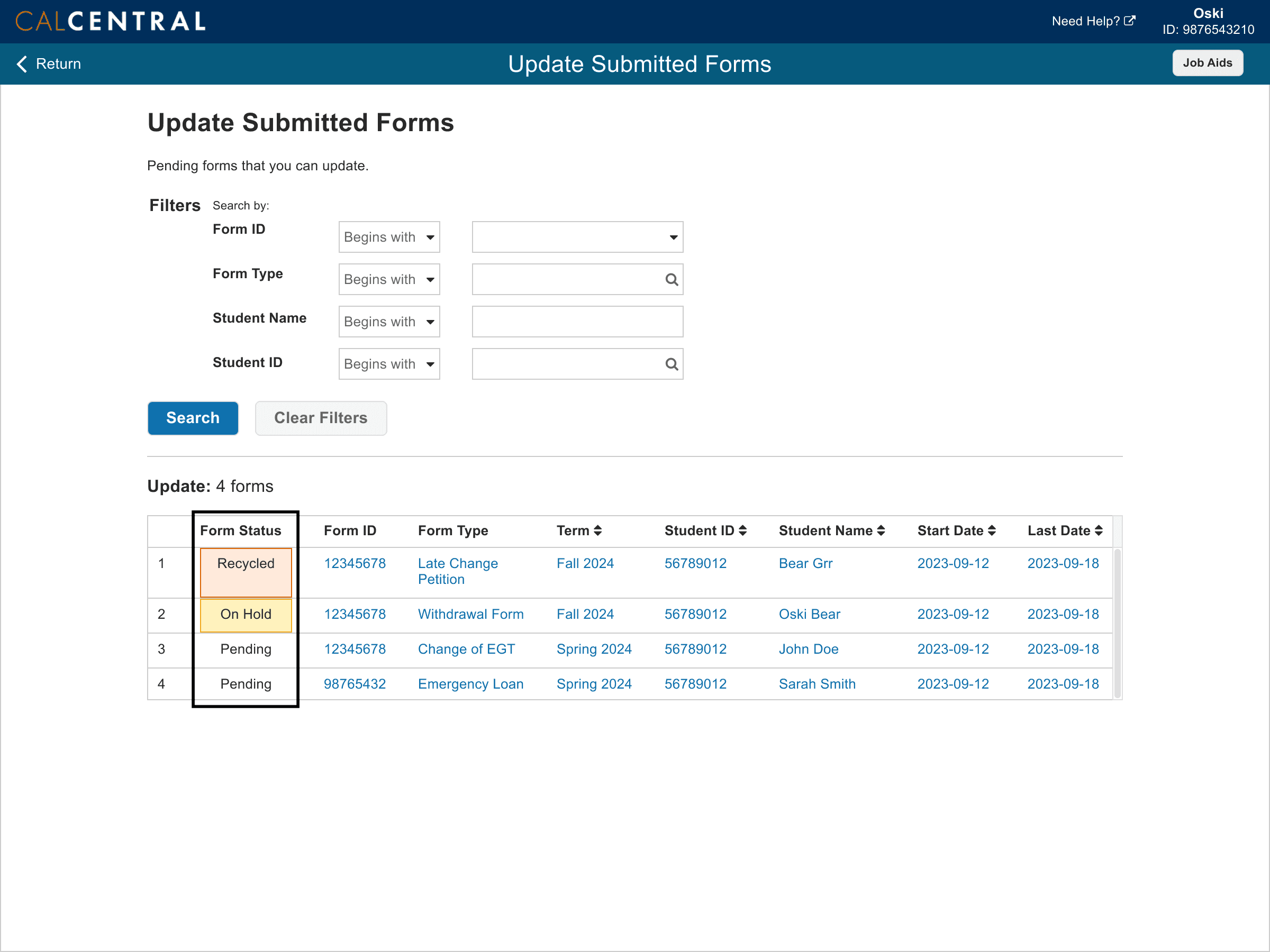
Finding #3
Students liked having one link to access the Forms Center from CalCentral, but didn't read through the forms description.
Recommendation #3
Remove extra text and direct students to the Forms Center link.
Finding #4
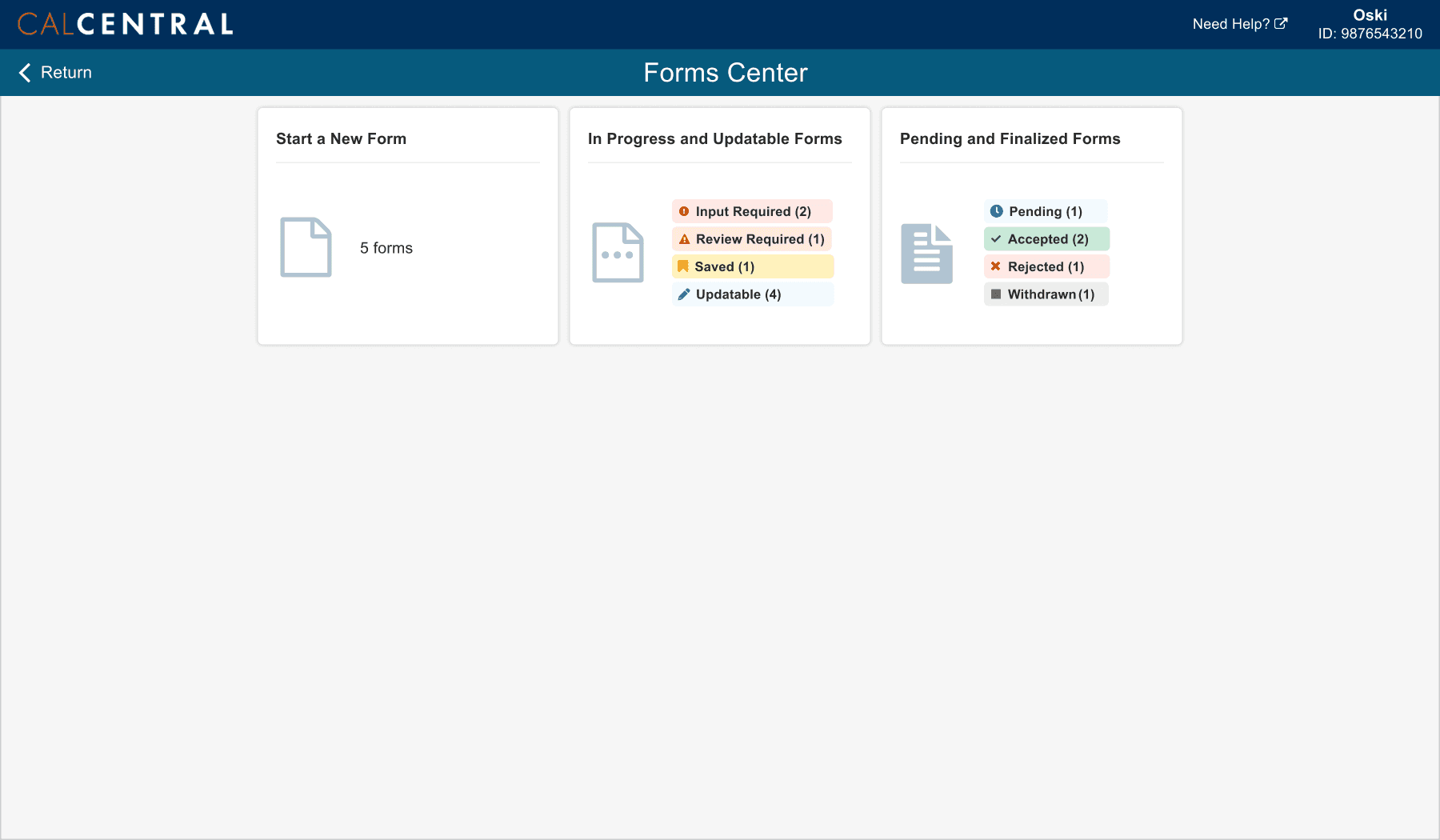
Some students were unsure of the difference between the tiles despite being able to complete their tasks, and the amount of badges caused cognitive overload.
Recommendation #4
Rename tiles and descriptions to match student expectations. Only display badges for forms that require students' attention.

Finding #5
Extra clicking into each form category felt unnecessary because students typically would only have 0-5 eForms to view in the Forms Center at a time.
Recommendation #5
Instead of having different tabs in each tile, display all forms directly in the table with the forms status clearly indicated.
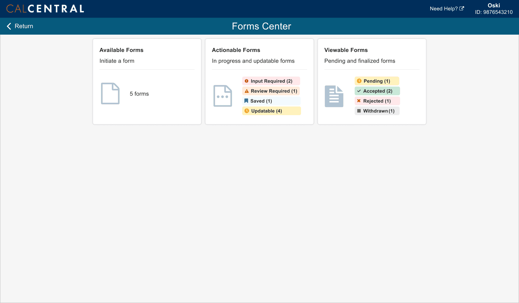
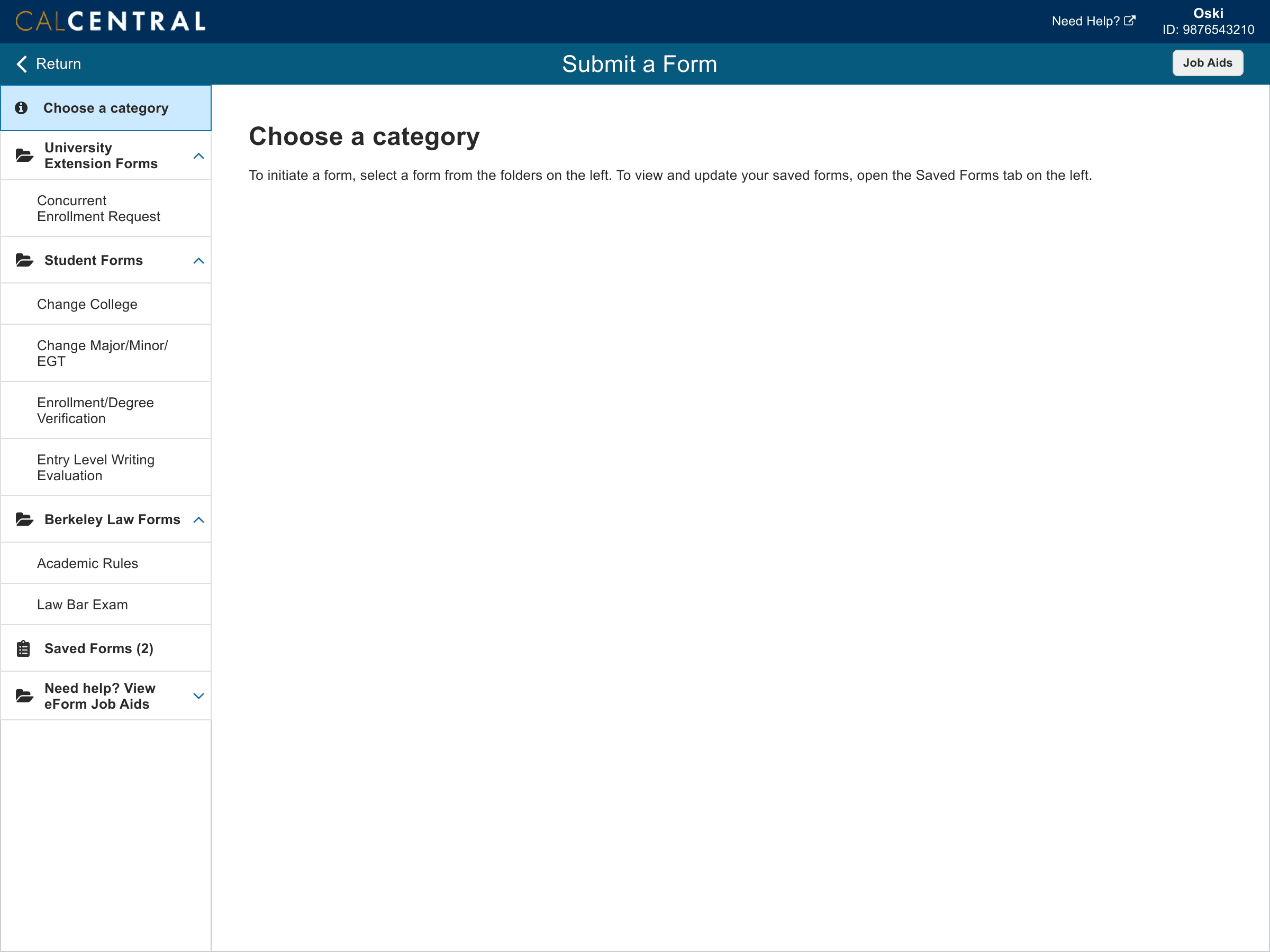
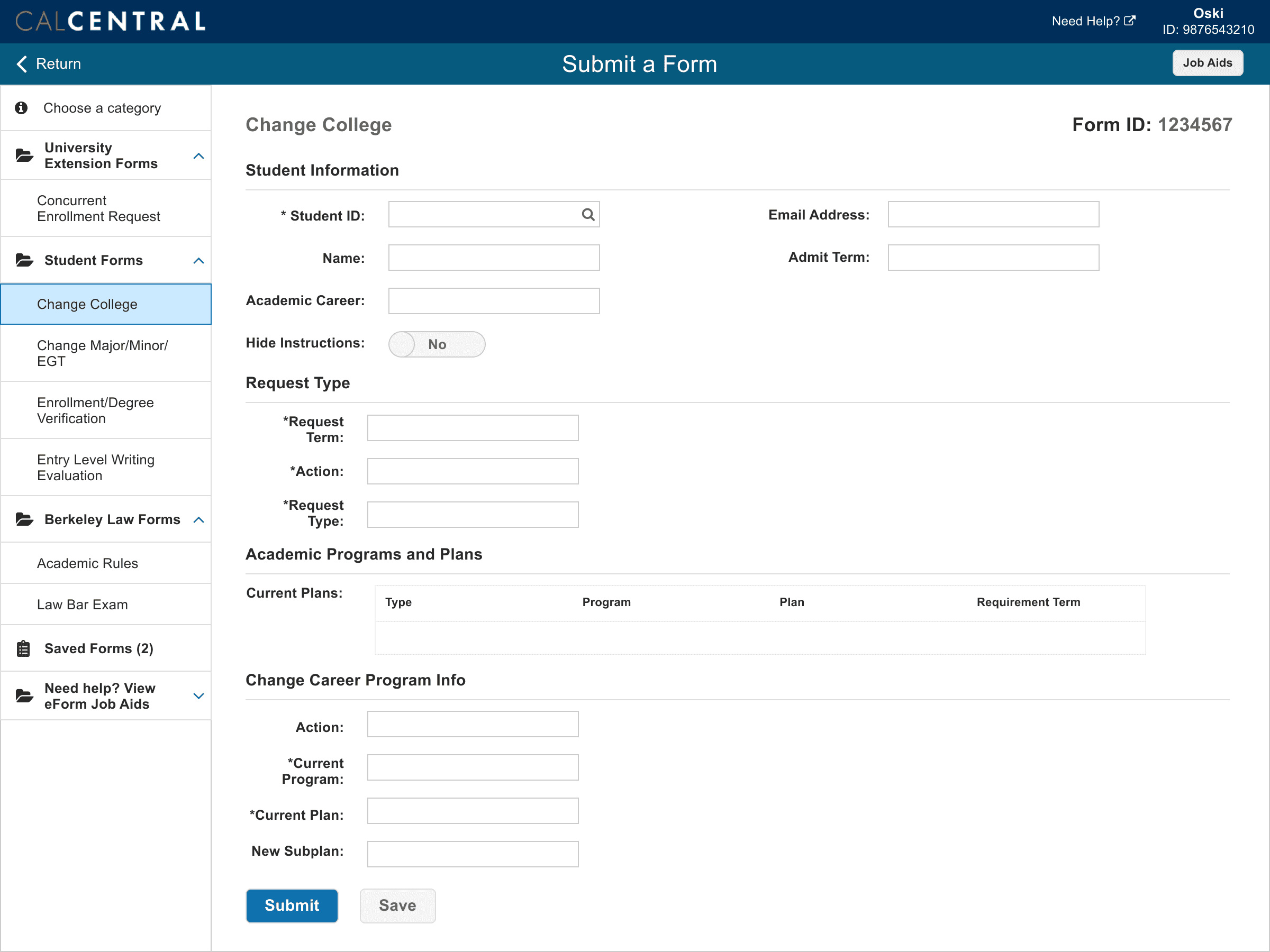
Final Screens
Introducing the Forms Center, a new eForms experience for both students and staff
Staff

Students


Outcome
Addressing user needs while reducing development costs
Usability testing helped reduce development efforts by discovering certain customizations were not needed.
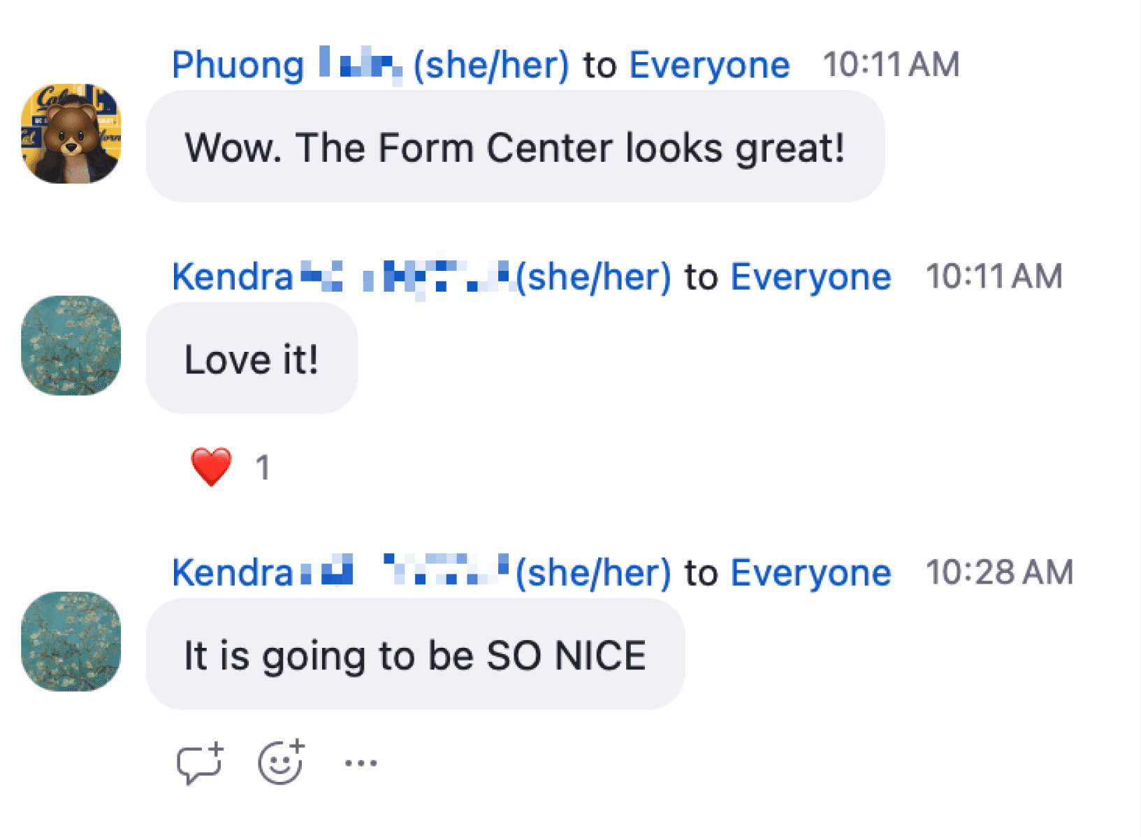
Though the Forms Center is still in development due to unforeseen development roadblocks, previews to campus have garnered high interest from staff and students across campus.
Some minor design compromises had to be made due to limited configuration options, such as not hiding the left nav bar. However, the overall usability of the form was retained as the user flow and content remained untouched.
“To have this sort of centralized Forms Center is really great. I think it will really be a value add to the work.”
- Advisor, Rausser College Office of Instruction & Student Affairs
Learnings
What did I learn from this project?
Handoff designs using the medium developers prefer, not the way the designer prefers.
Although I built and annotated every iteration using Figma, some design changes would still be overlooked. I noticed that my team relied on documentation like spreadsheets or documents, so, rather than handing off the Figma file to developers and business systems analysts, I used Google Docs to document each page and elements of the design. This was very successful and ended up being the main file shared amongst the team when discussing design.
It's not necessary to reinvent the wheel when users are already well versed in a technology.
When I first approached eForms, I was confused by the technology and thought it needed to be updated to use modern elements. However, after speaking with users and understanding the limitations, I learned that it would actually hurt the users if I changed the process that they were so well adapted to. So, I approached the design with the mindset of enhancing the current functionality, rather than creating new functionality.